Nikita Khanna, founder of Moxie, came to us with an ambitious vision: build a brand to introduce India to the beauty of textured hair, all while disrupting the beauty aisle. Tired of curls and waves being viewed as "wild" and "messy" in India, she envisioned a brand that celebrated individuality.
Challenge
India has always idealised poker-straight, long, silky hair, and has only recently started bringing curls into the haircare conversation. But the concept of anything in between, i.e. textured hair, was entirely alien. Hair that was wavy or frizzy was called “unruly” and “untameable”. How could we show beauty that lay in unique textures, and fight this narrative head on?
Strategy
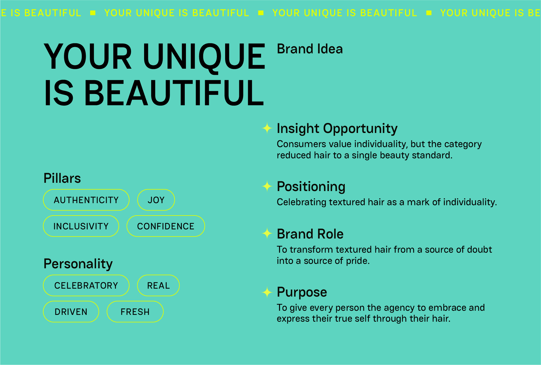
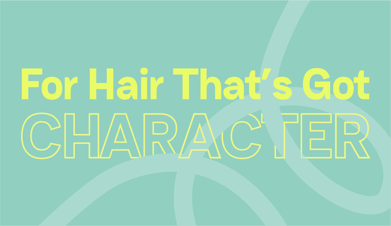
Armed with the positioning of 'your unique is beautiful', we reframed hair that looked "different" from a problem to a point of pride. The idea that your hair "had character" let consumers champion their individuality. Beyond an aesthetic, this was their identity, their statement, their Moxie.
Design Approach
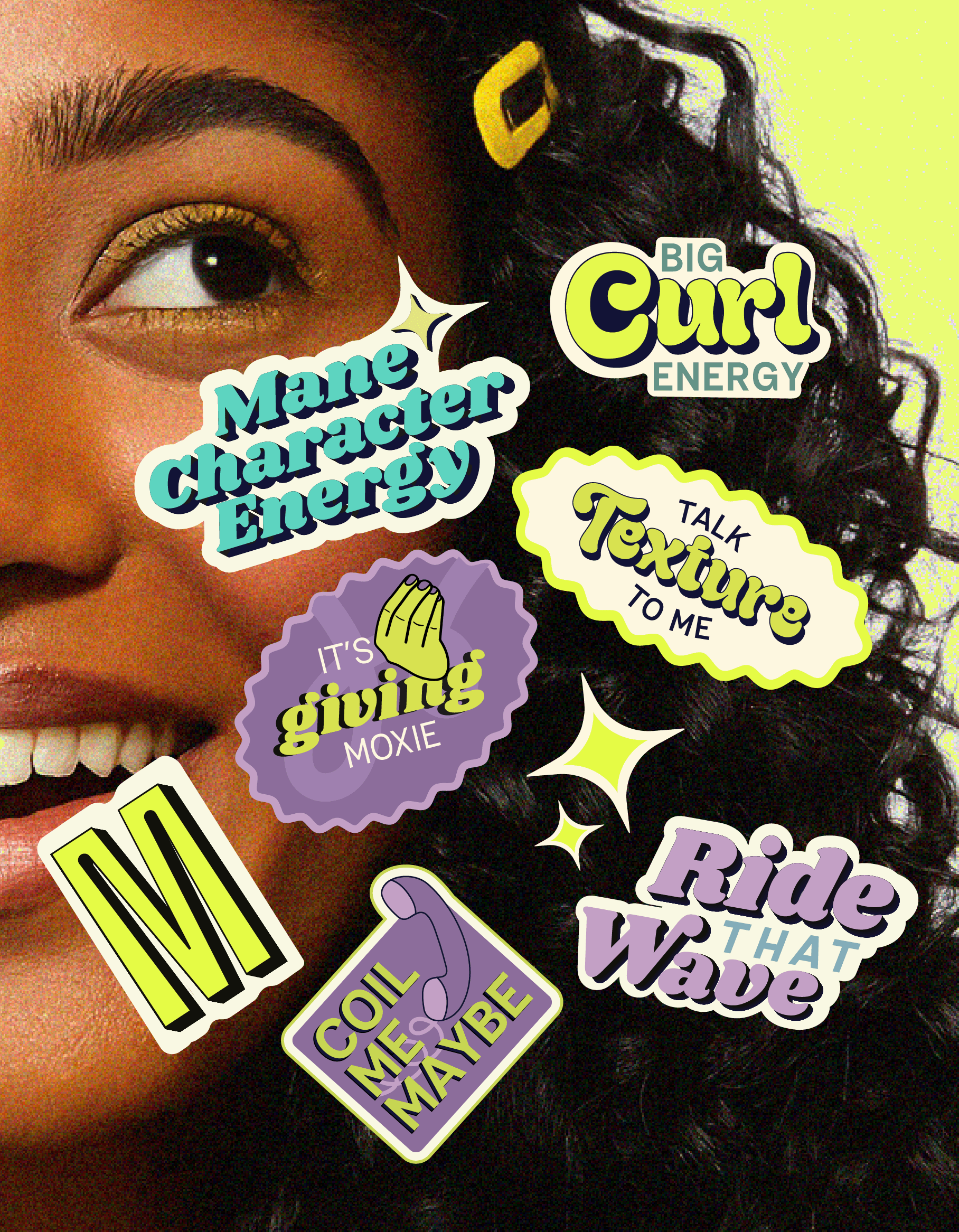
By studying Gen Z’s perceptions, values, and visual preferences, we understood that they value self-expression rooted in confidence. Moxie was designed to feel joyful while grounded in strength, positivity, and bold individuality.
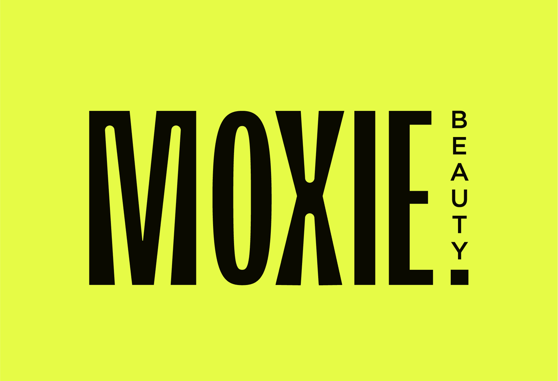
Logo All-uppercase lettering with a wide base conveys confidence, while the exclamation mark and horizontal “beauty” add energy and excitement.
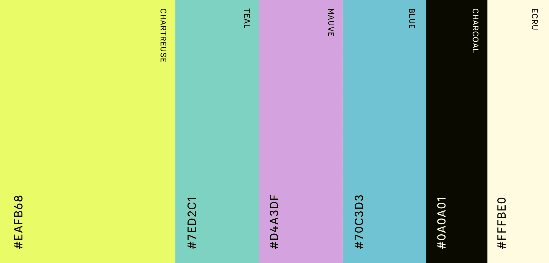
Color Palette Chartreuse was chosen as a bold, gender-neutral primary color to break through the aisle’s pinks and mauves, supported by teal, mauve, and blue for balance.
Typography A simple grotesque font reinforces scientific credibility and efficacy.
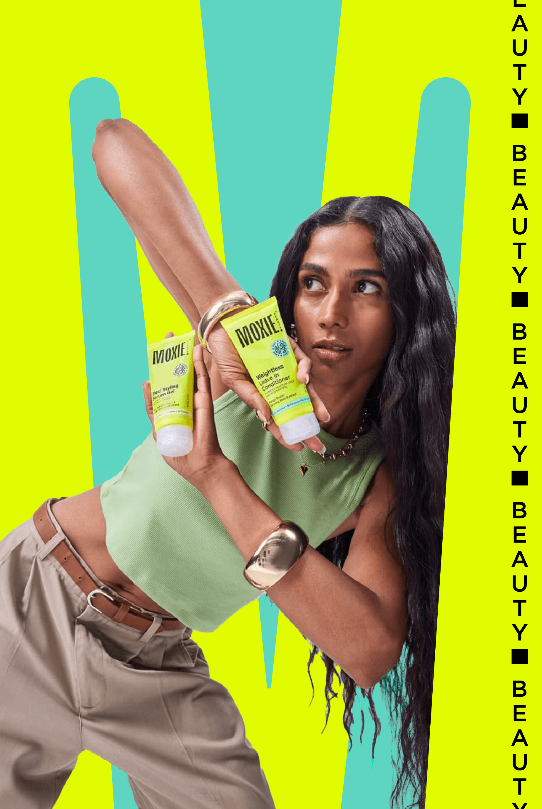
Photography Raw, unedited hair is captured in candid moments, with strong representation of Indian people across all genders, shot in dynamic, modern angles that reflect youthful energy.
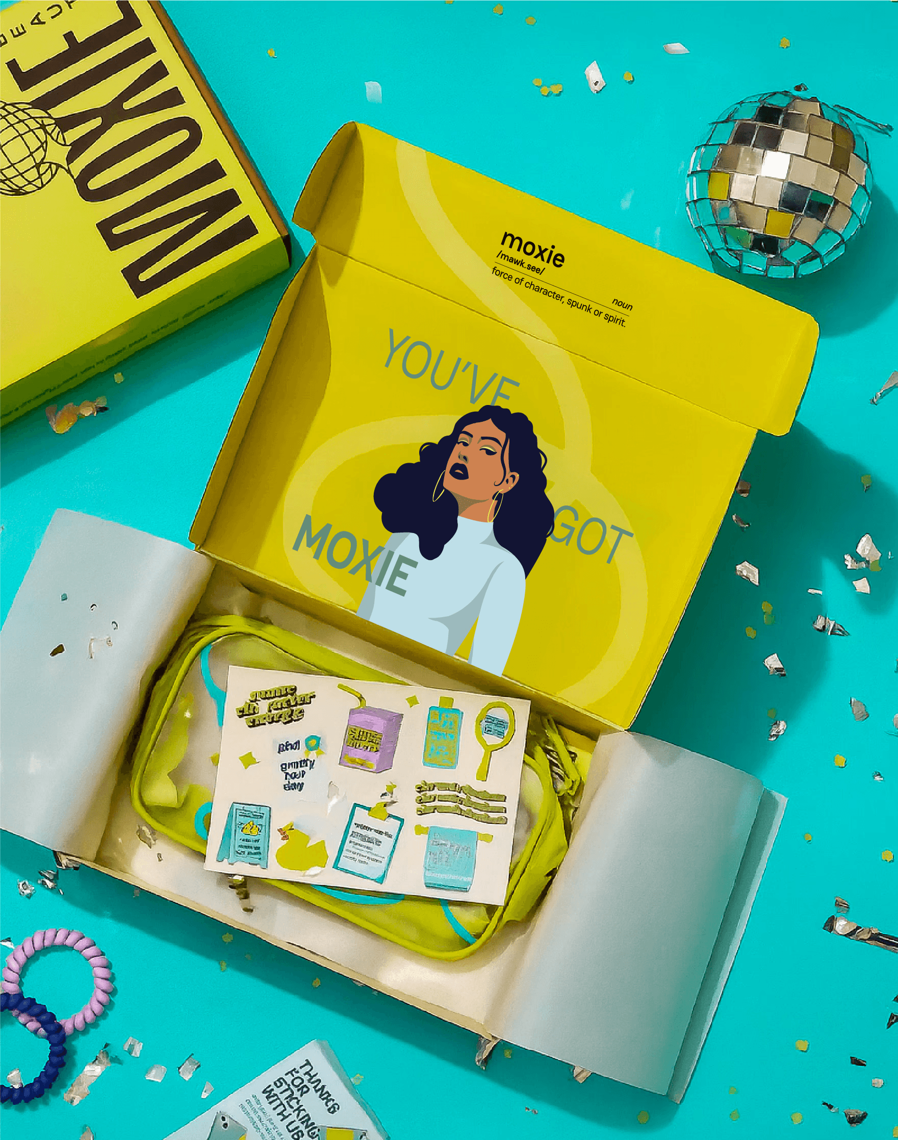
Shaking Up The Beauty Aisle
Packaging Process
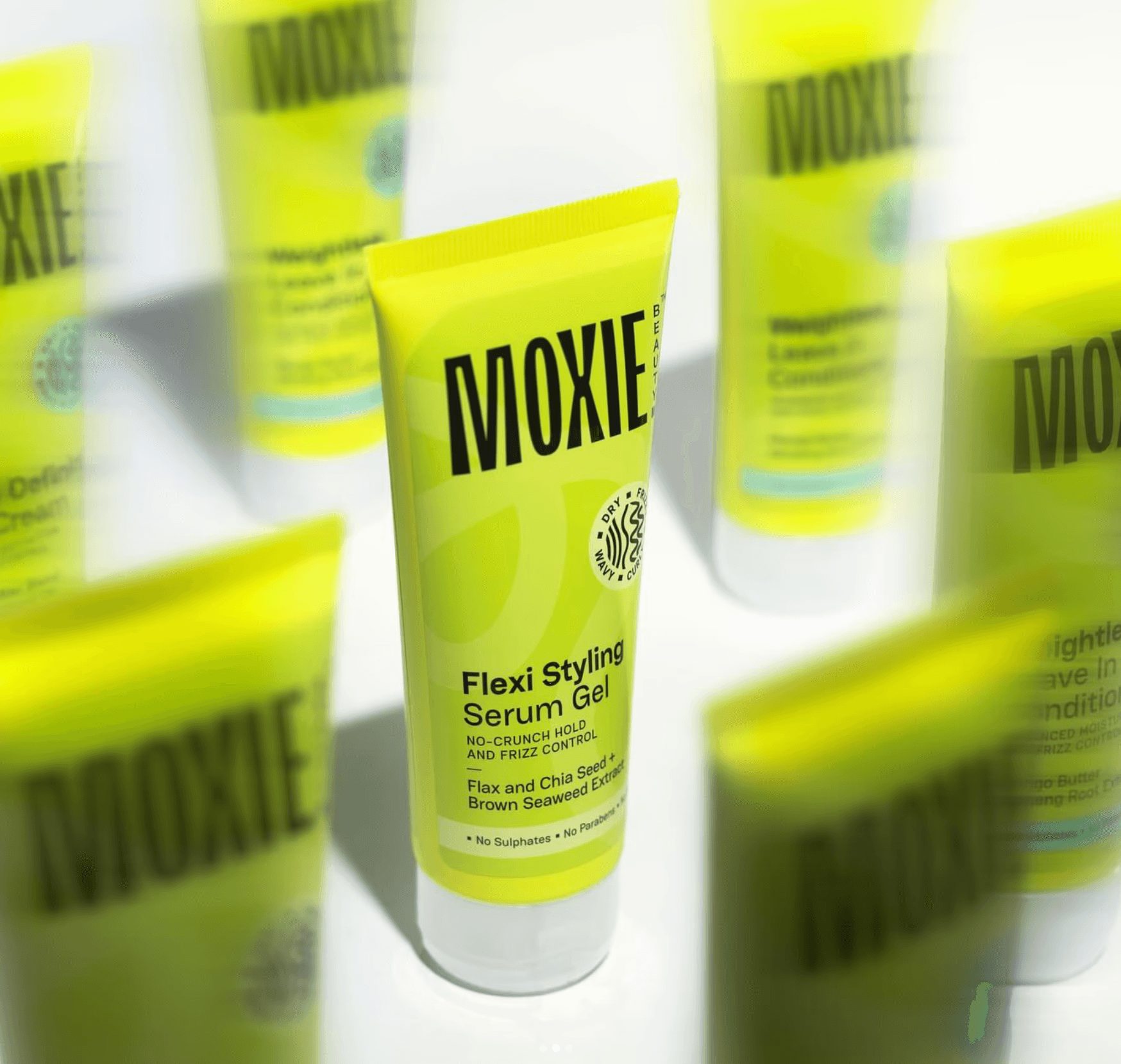
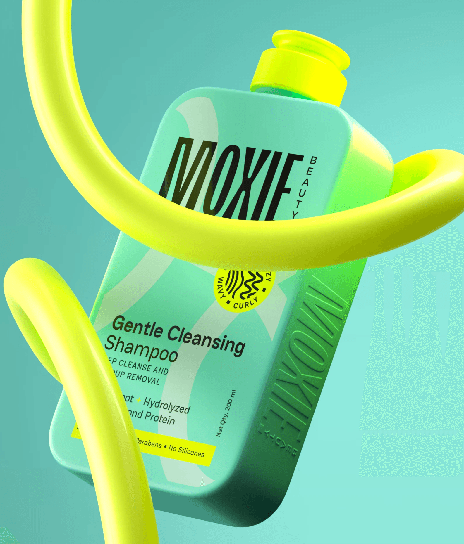
Objective Create packaging that is identifiable, premium, benefit-led, and texture-inclusive, with a unified system across the range.
Research We studied form, material, design, and user experience. Trend boards and consumer insights guided our decisions, with a focus on visibility on D2C platforms.
Insight Gen Z values self-expression, but consumers trust science in personal care. Clean, benefit-led packaging communicates efficacy and builds credibility.
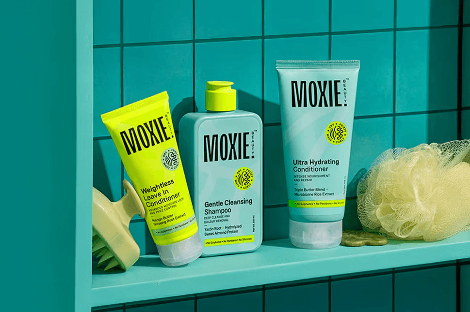
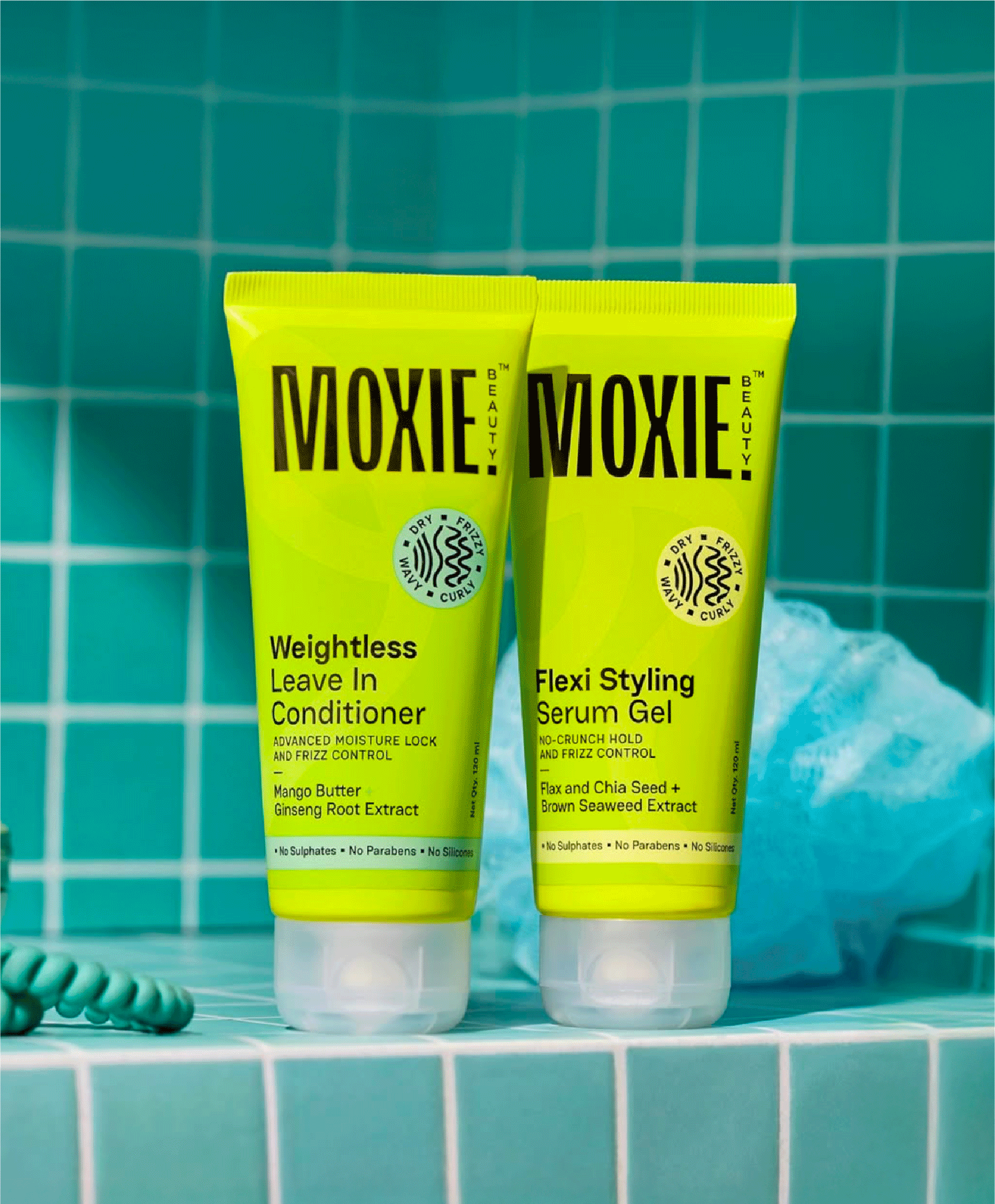
India's beauty aisle is dominated by pinks and purples, so we picked colours that would be unmistakably Moxie - gender- neutral chartreuse and teal. The packaging was designed to stand out on shelf while remaining ergonomic, benefit-led, and texture-inclusive.