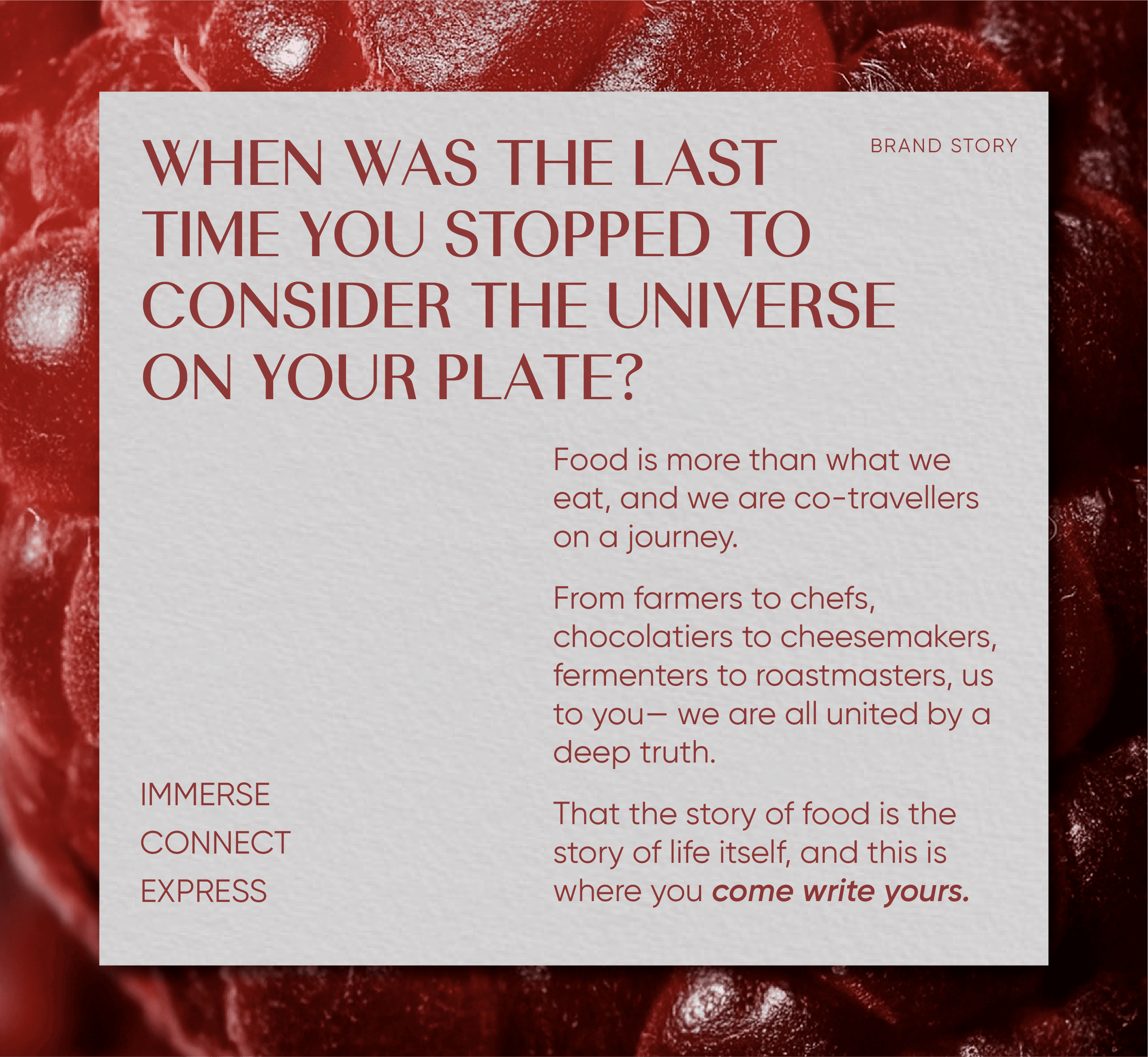
A decade ago, India’s relationship with food was still defined by geography. Global cuisines and rituals existed only in fine dining rooms or travel diaries. With social media and globalisation, consumers have become more culturally fluent. Today, they seek more than taste. They look for connection, discovery, and meaning in every culinary experience.
Imagine a vast library of food, where you could explore South Korea’s tissue bread, France’s finest cheeses, and the humble orange from Nagpur, all under one roof. Foodstories set out to create a place where every ingredient tells its own story.
Challenge
Gourmet offerings often feel intimidating. The goal was to create a kind of luxury that felt conversational, not cold. The also brand needed to scale across multiple categories, from bakery to spices, gifting to dry fruits, through a unified yet flexible design system that could adapt across hundreds of SKUs and in-store touchpoints.
Strategy
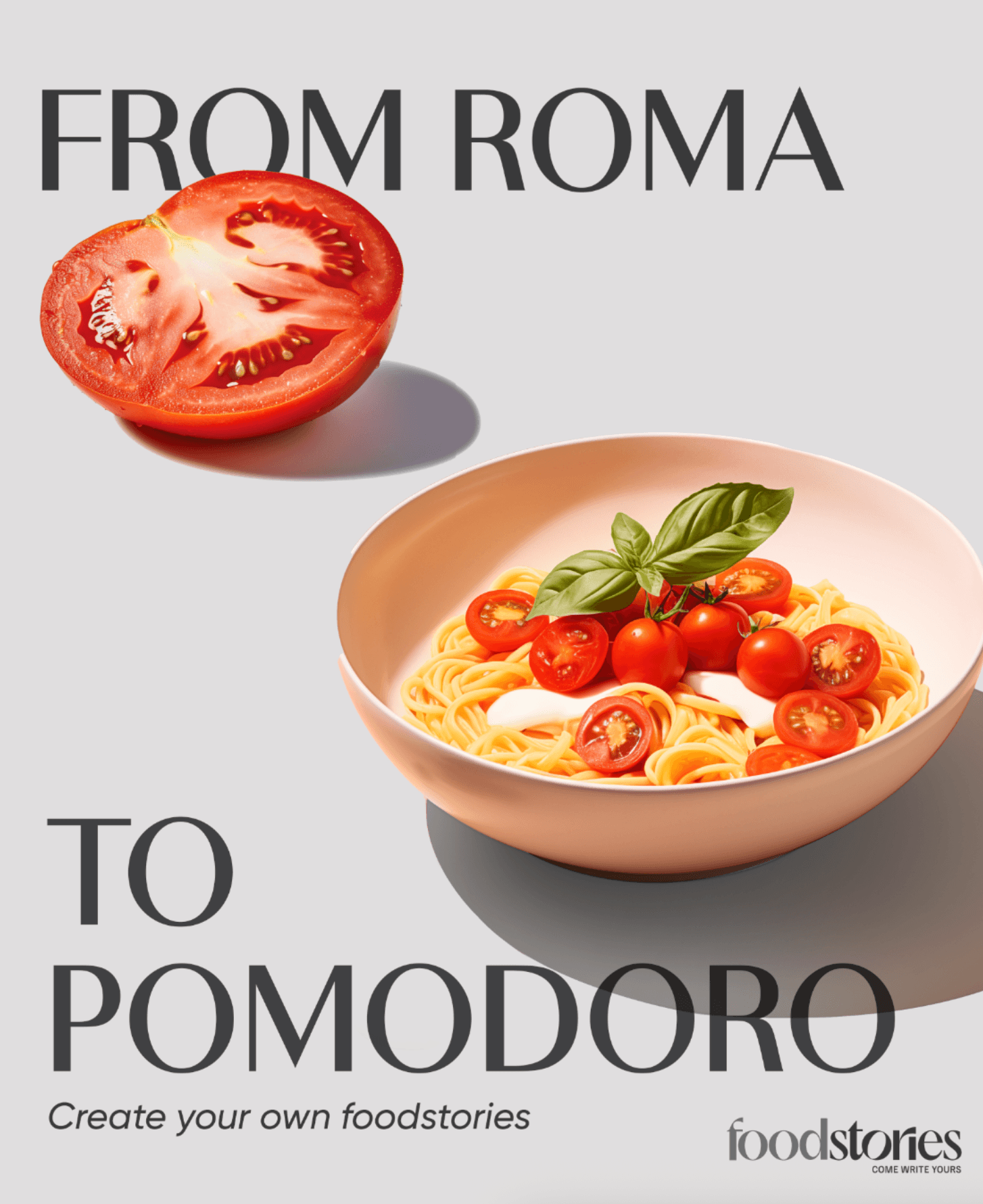
BEYOND GUACAMOLE
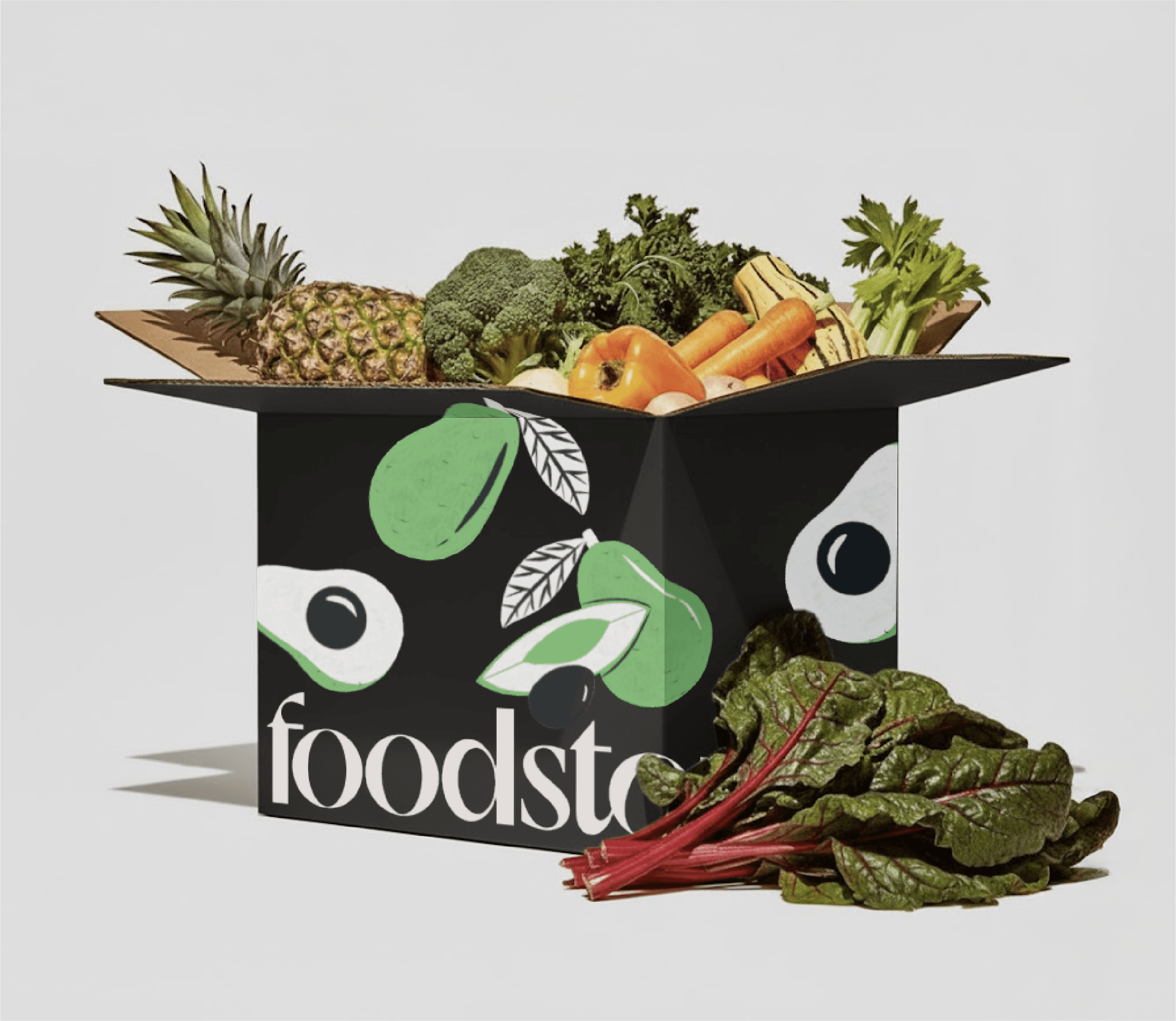
For years, avocado only meant guacamole. But at Foodstories, The avocado counter could lead you down the aisles toward something unexpected, a smoothie, a dessert, or the beginning of a new flavour journey.
Design – Identity
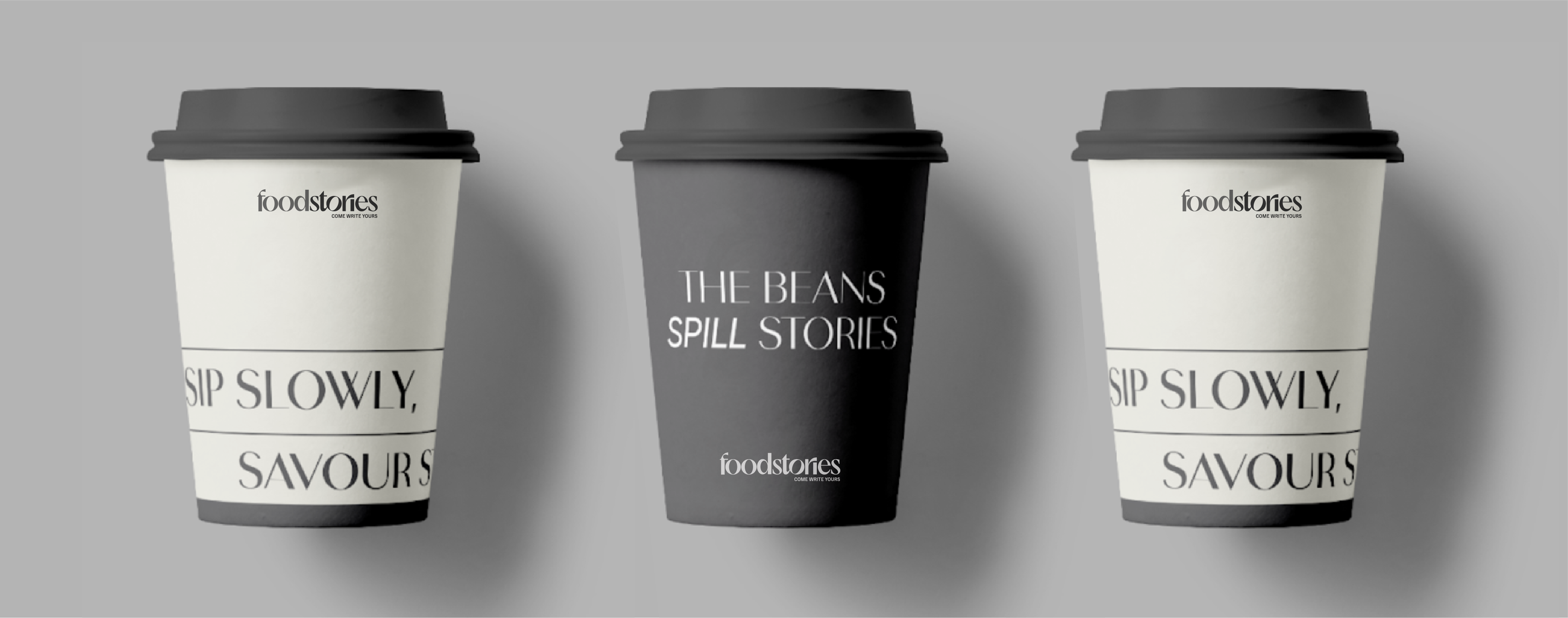
Logo: Like every good story, the Foodstories wordmark takes you on a journey. The all-lowercase wordmark with soft modern serifs feels familiar yet refined.
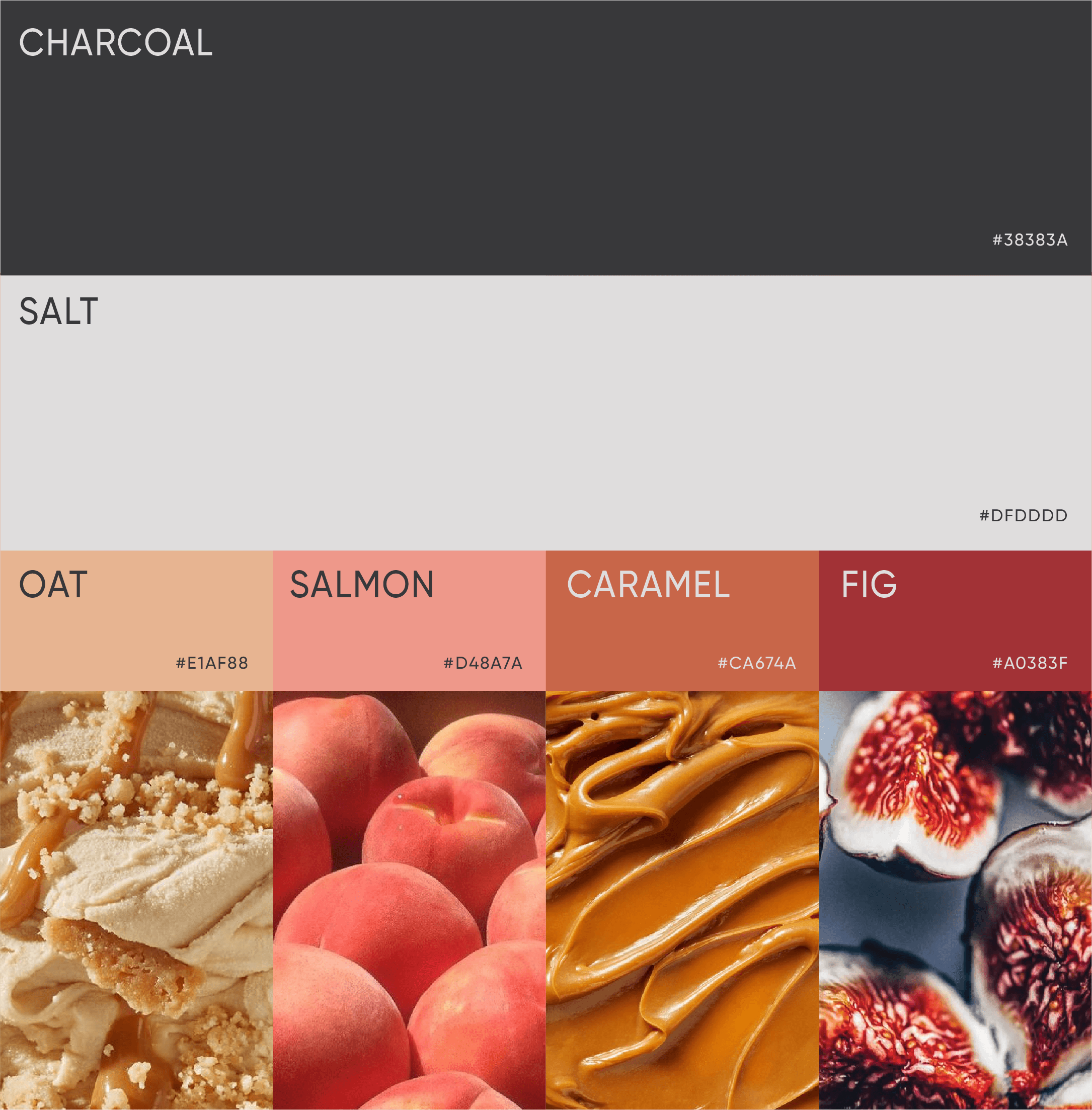
Colours: A neutral base of light and charcoal grey lets the food shine, while secondary hues draw from real ingredients, creating a palette that feels lived-in, authentic, and appetising.
Typography: Russolo and Gilroy create a contrast of elegance and simplicity, with Ivy Presto adding a graceful accent.
Photography: Close-up textures and cross-sections capture food as art, intimate, detailed, and timeless.
Illustrations: Organic brush strokes and fluid textures bring a handcrafted, human touch to the system.
Communication System
Given Foodstories’ vast retail scale, we designed a multi-level communication framework that balanced consistency with expression
Brand Level Communication — Captured the overarching brand story and “Delicious Possibilities” philosophy through hoardings, paper bags, and directories.
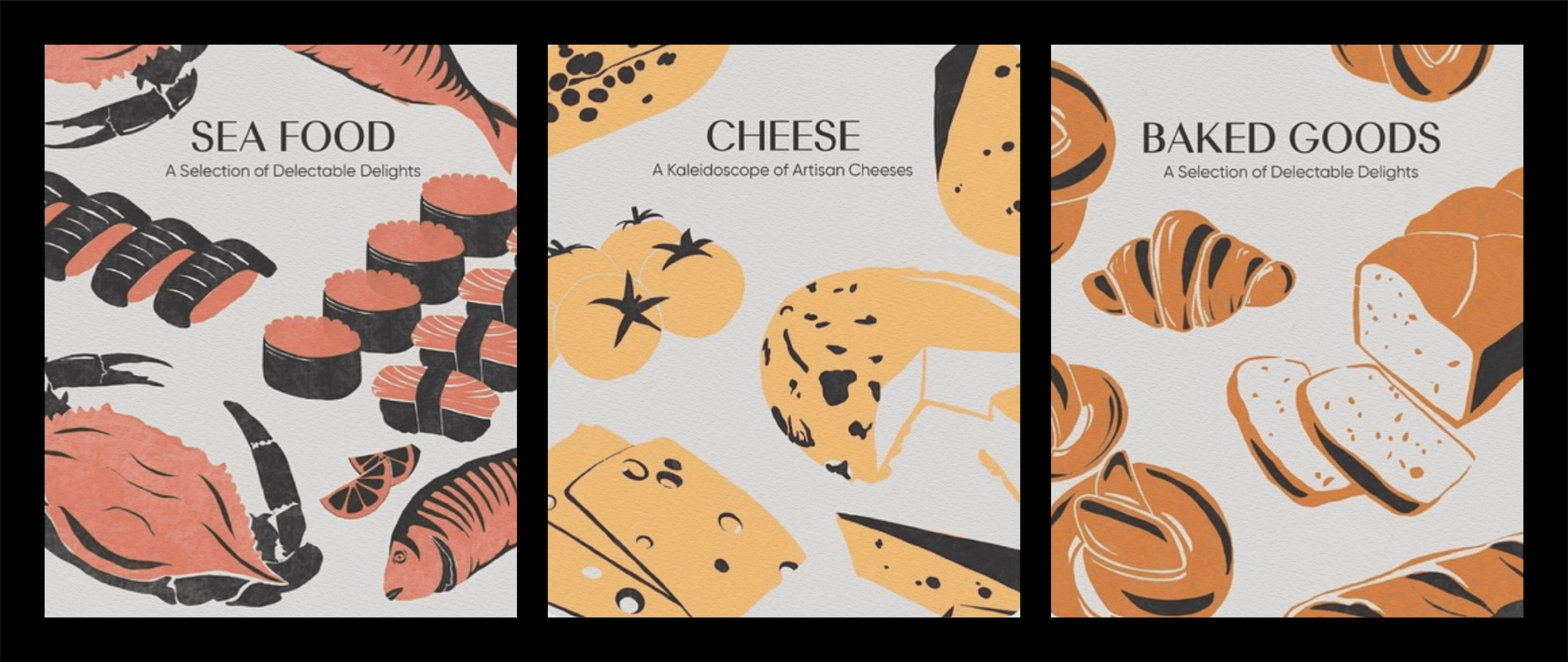
Category Level 1 — Introduced each broad category like Bakery, Cheese, Fruits & Vegetables, Spices, etc., defining their unique worlds.
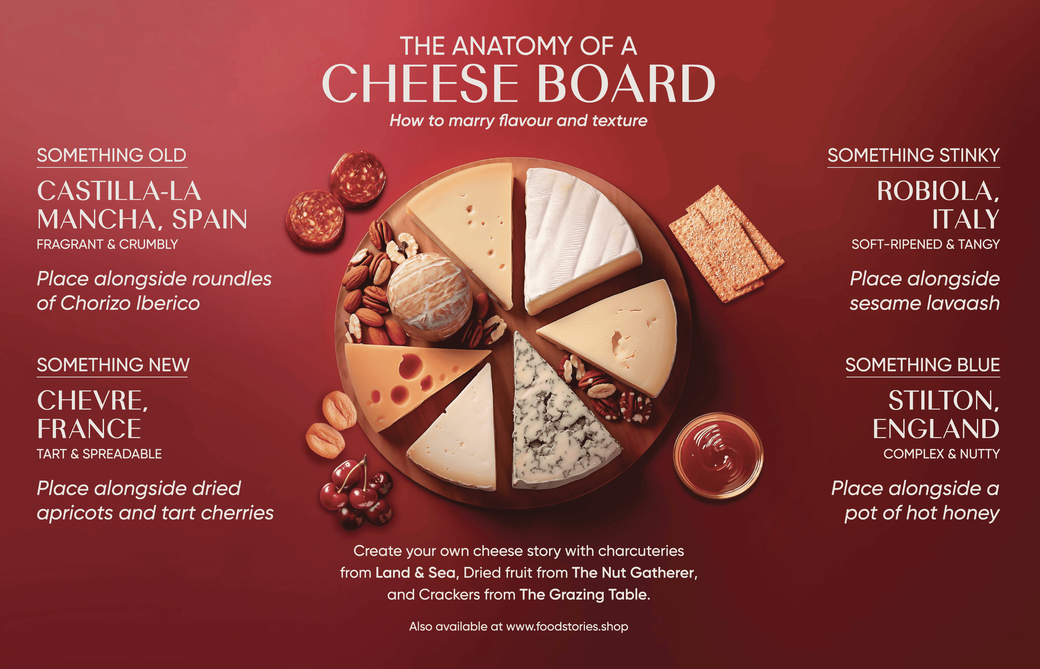
Category Level 2 — Educated consumers through in-depth explorations, such as understanding the types of cheeses on a board.
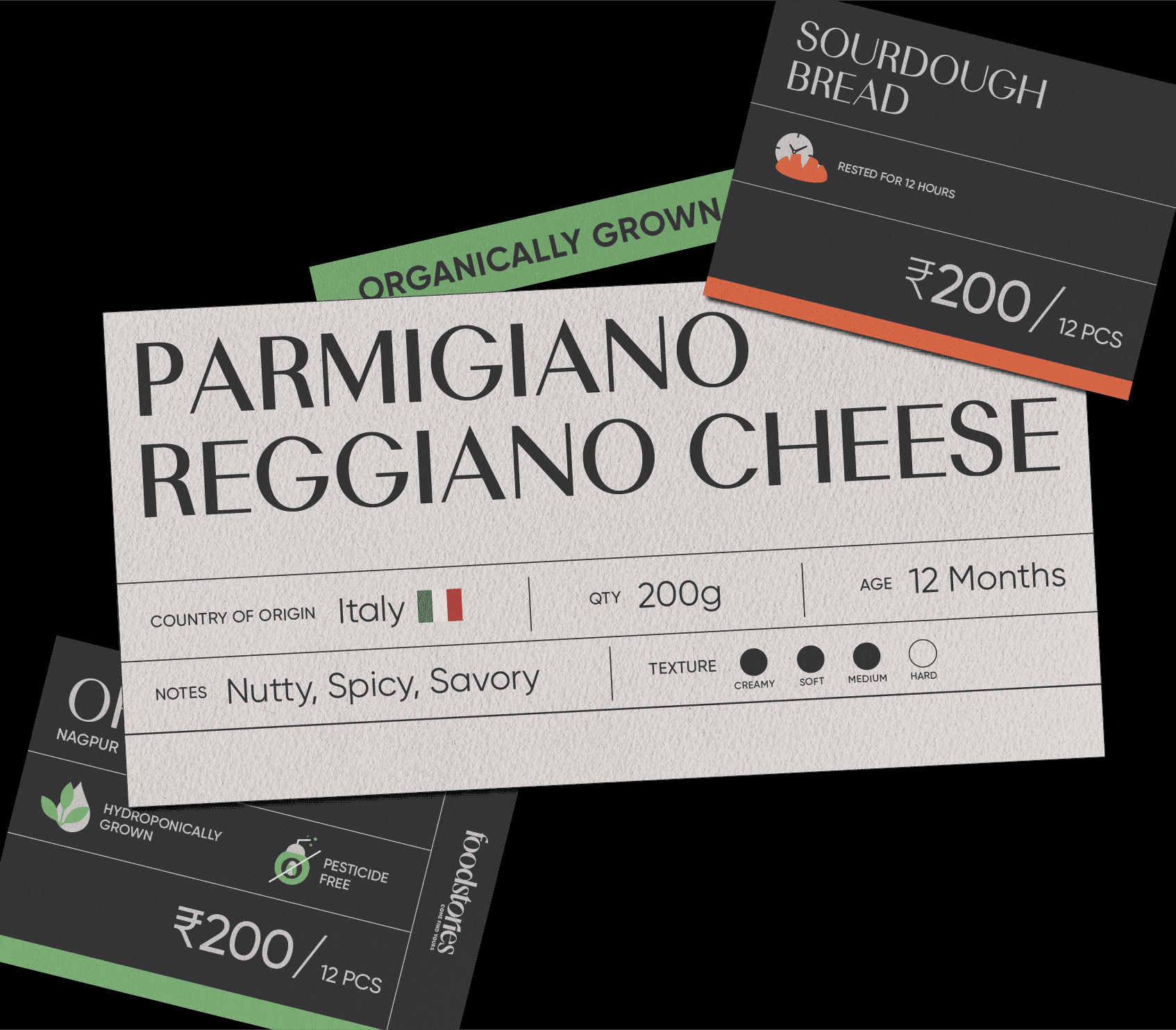
Category Level 3 — Focused on individual products — packaging, shelf communication, and tasting notes — to drive discovery and storytelling at the micro level.
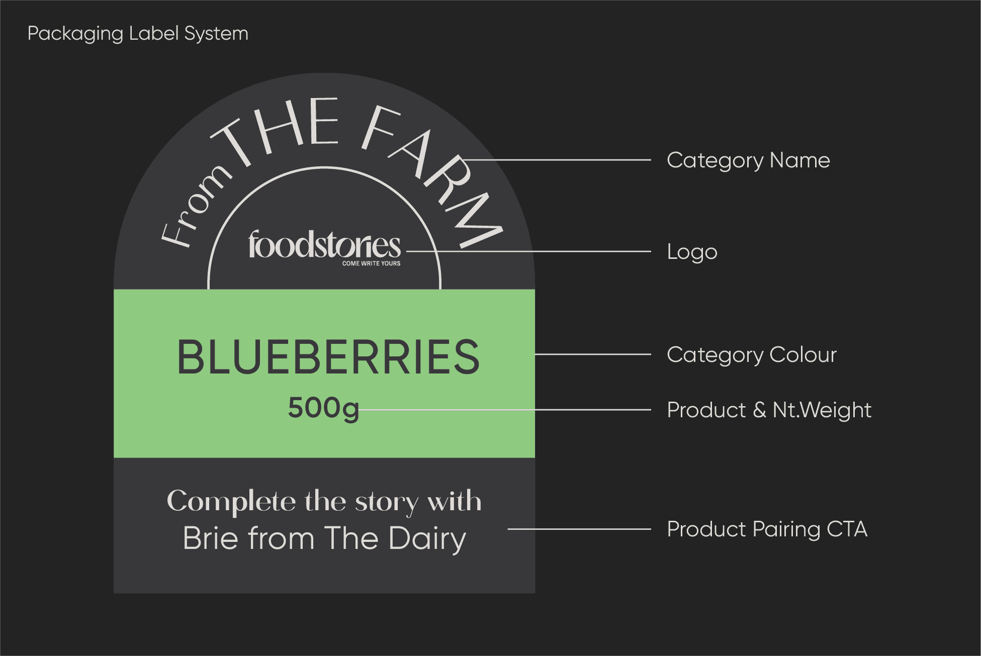
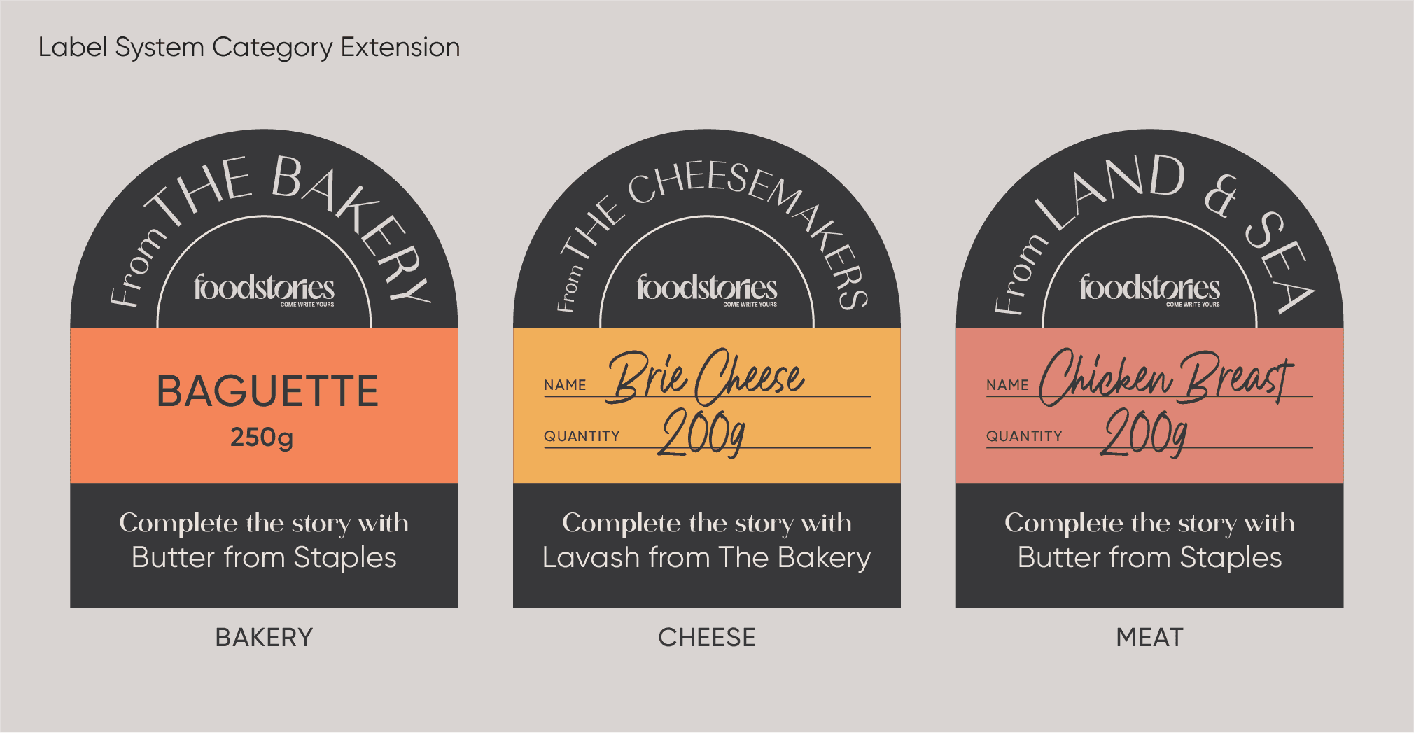
Packaging System
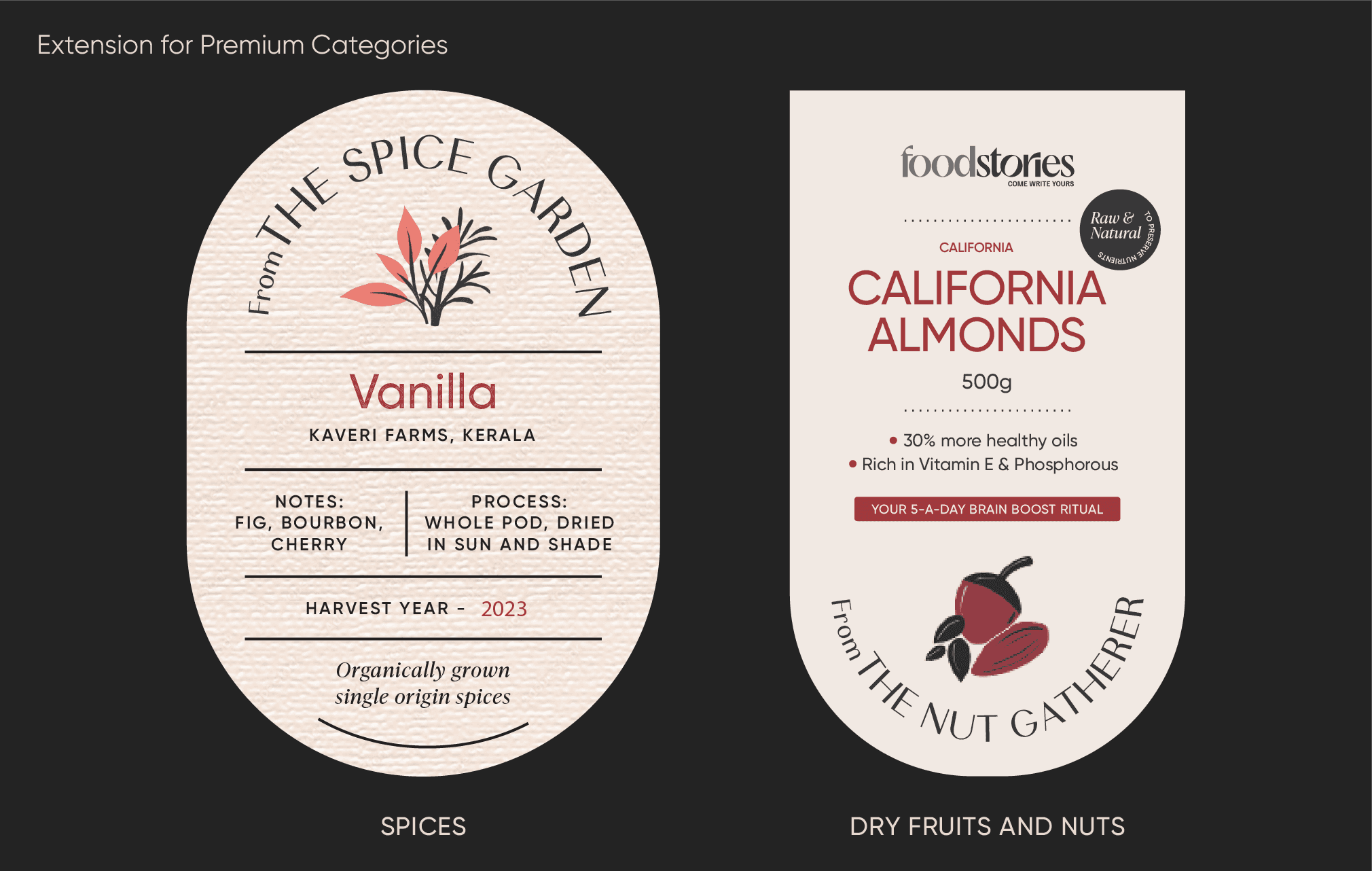
Designing for seven major sections — Fruits & Vegetables, Cheese, Bakery, Meat, Dry Fruits, Spices, Pantry, and Gifting — required a modular yet distinct system.
Each category followed its own sensorial code:
Freshness and transparency for Fruits & Vegetables
Premium warmth and texture for Spices and Dry Fruits
Elevated craft and detail for Gifting
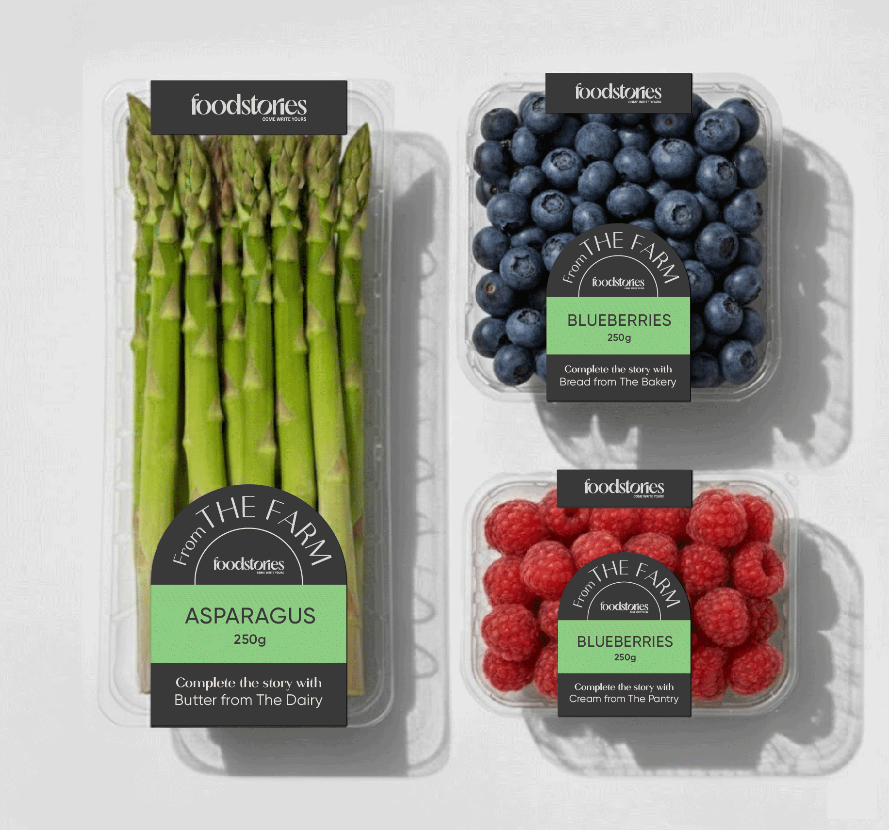
Regular Packaging
A unified label system with a distinctive dome shape became the core identifier. Each label carried the product name, category colour, and a playful line of copy inviting cross-category pairing — turning the act of shopping into an act of discovery.
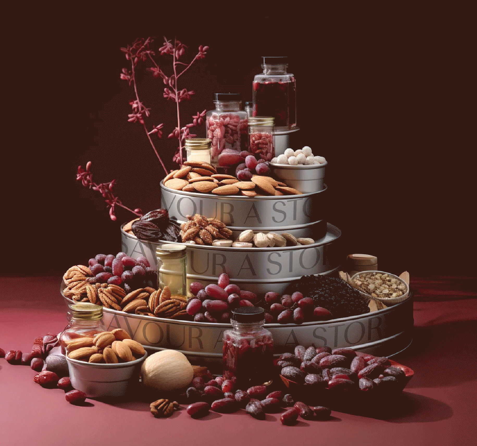
Gifting Packaging
Gifting was a key revenue driver, so each gift box was designed to feel tactile, crafted, and experiential. Every element — from materials to finishes — was designed to make it feel special, premium, and worthy of being gifted as a story.