

Born from founder Saumya’s personal hair journey, &done was created to give Indian women the premium, high-performance haircare they deserve, made for their hair, not borrowed from the West. Most luxury haircare brands cater to Western hair types and ideals, leaving Indian women underserved. Despite their busy, ambitious lives, they lacked products that truly worked for their unique needs and routines.
Strategy
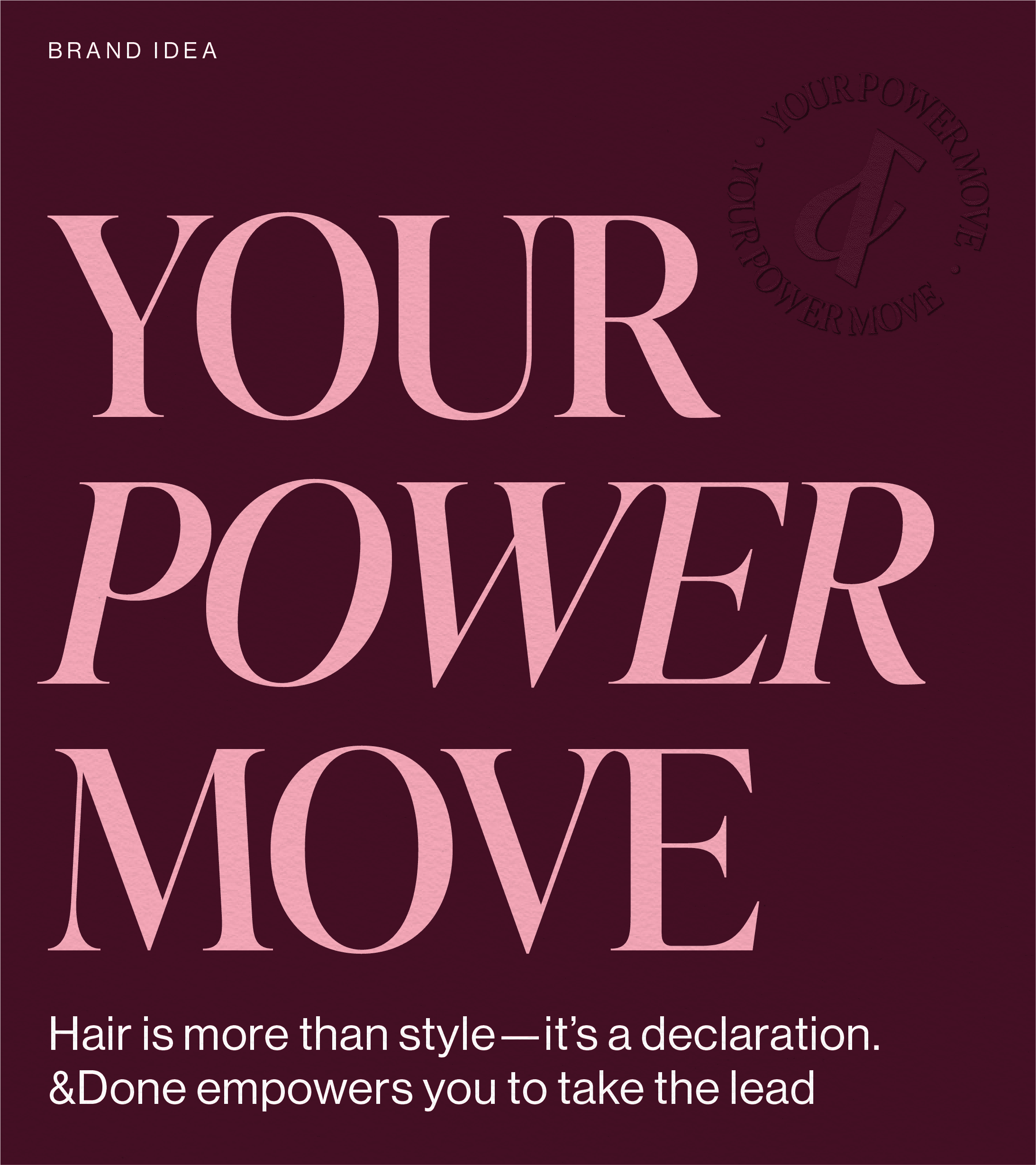
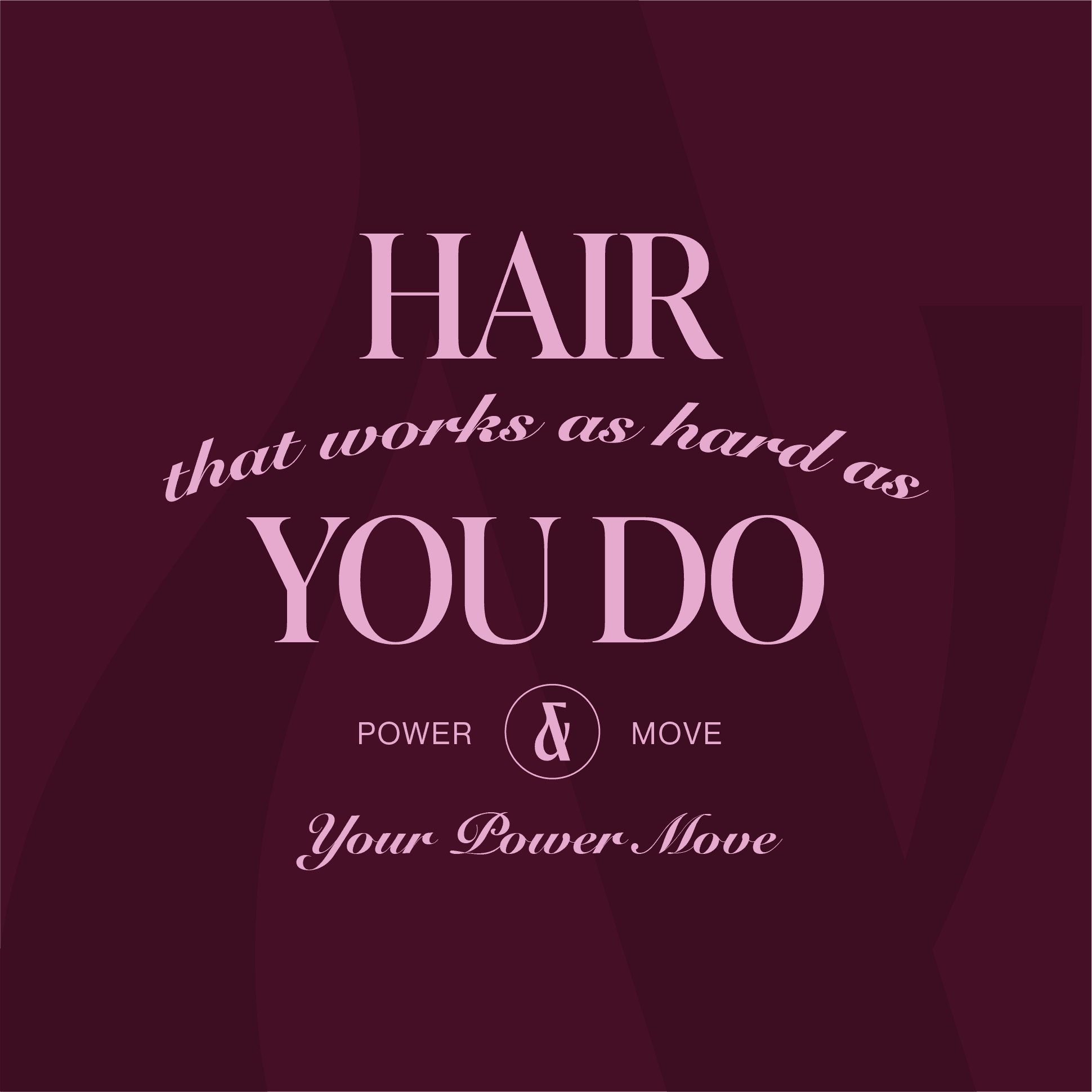
The idea was to position &done as The Power Move. The voice feels like an ally, not a beauty brand preaching perfection. &done is assertive, warm, and rooted in performance.
Our Approach
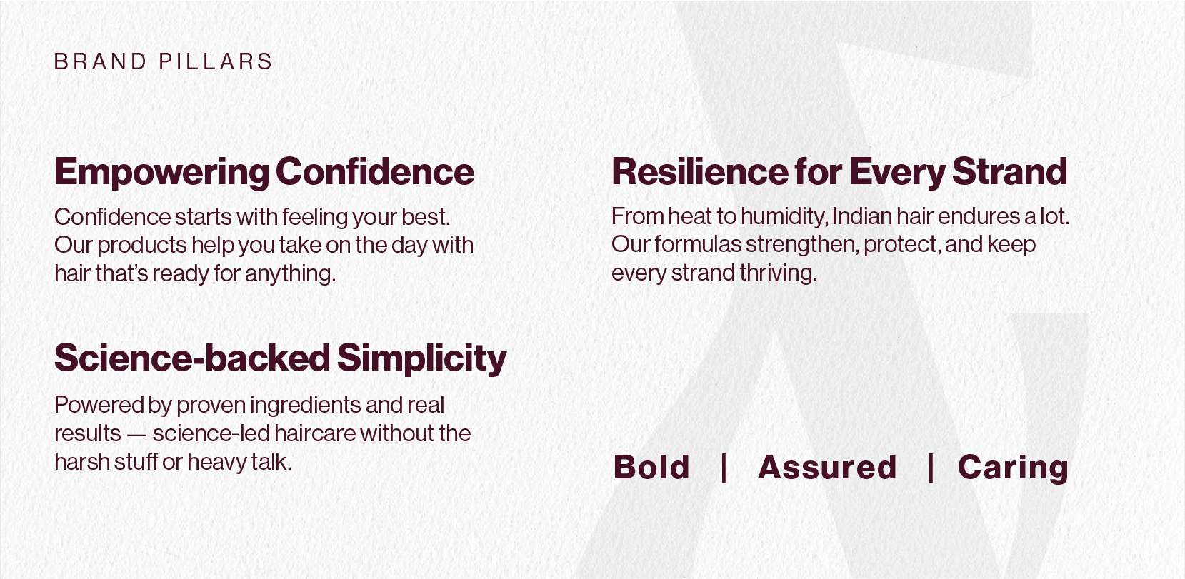
Cultural Relevance – Formulas and stories shaped by Indian realities like humidity, pollution, and diverse hair textures.
Empowerment Through Efficiency – Products that simplify routines. One and done.
Confident Aesthetic – A bold, elevated look that stands apart from pastel-heavy beauty shelves and resonates with women who get things done.
Challenge
How do we create a premium haircare brand that feels powerful yet effortless, speaks to Indian women in their language, and delivers results that match their pace of life?
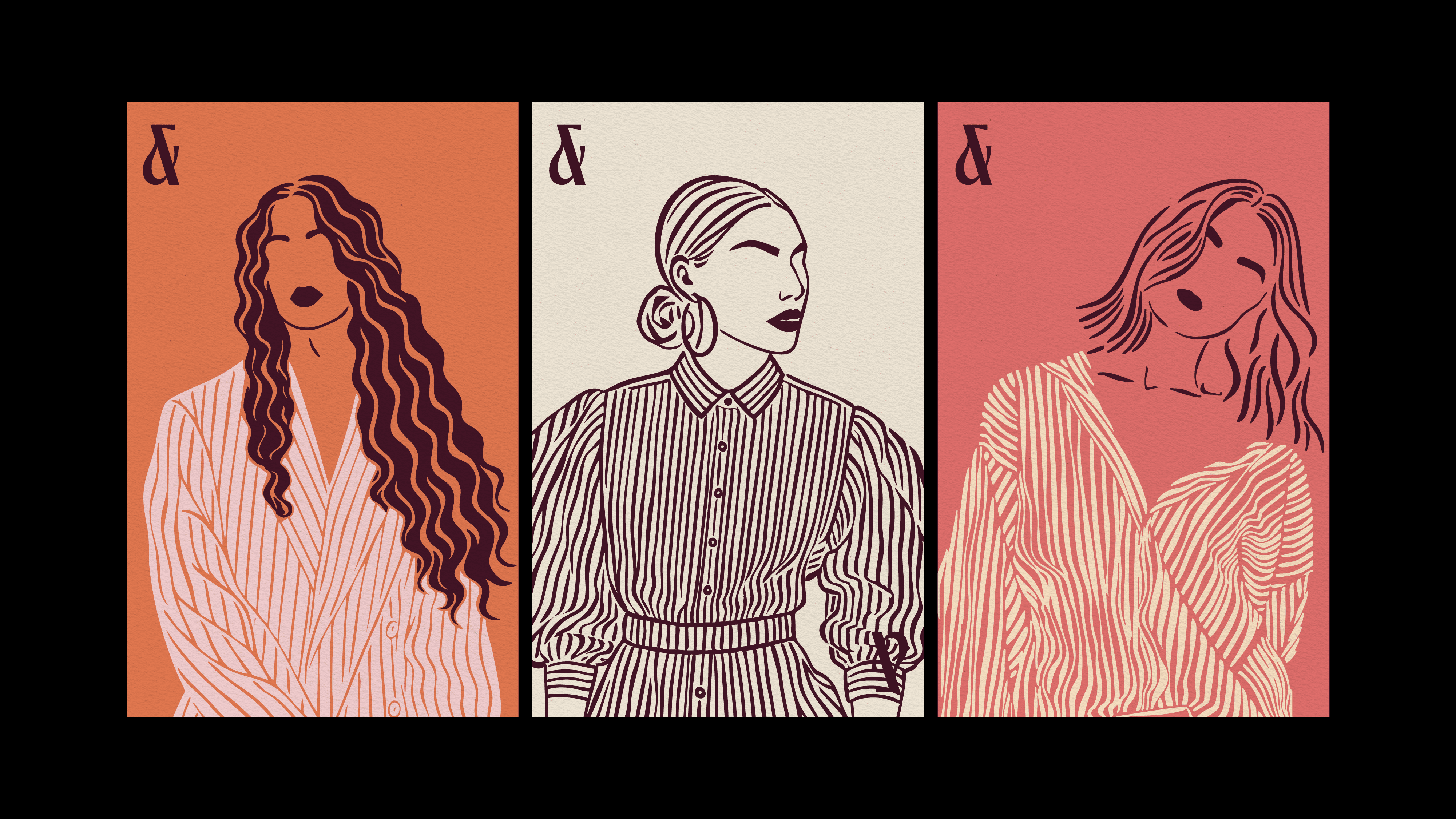
Logo
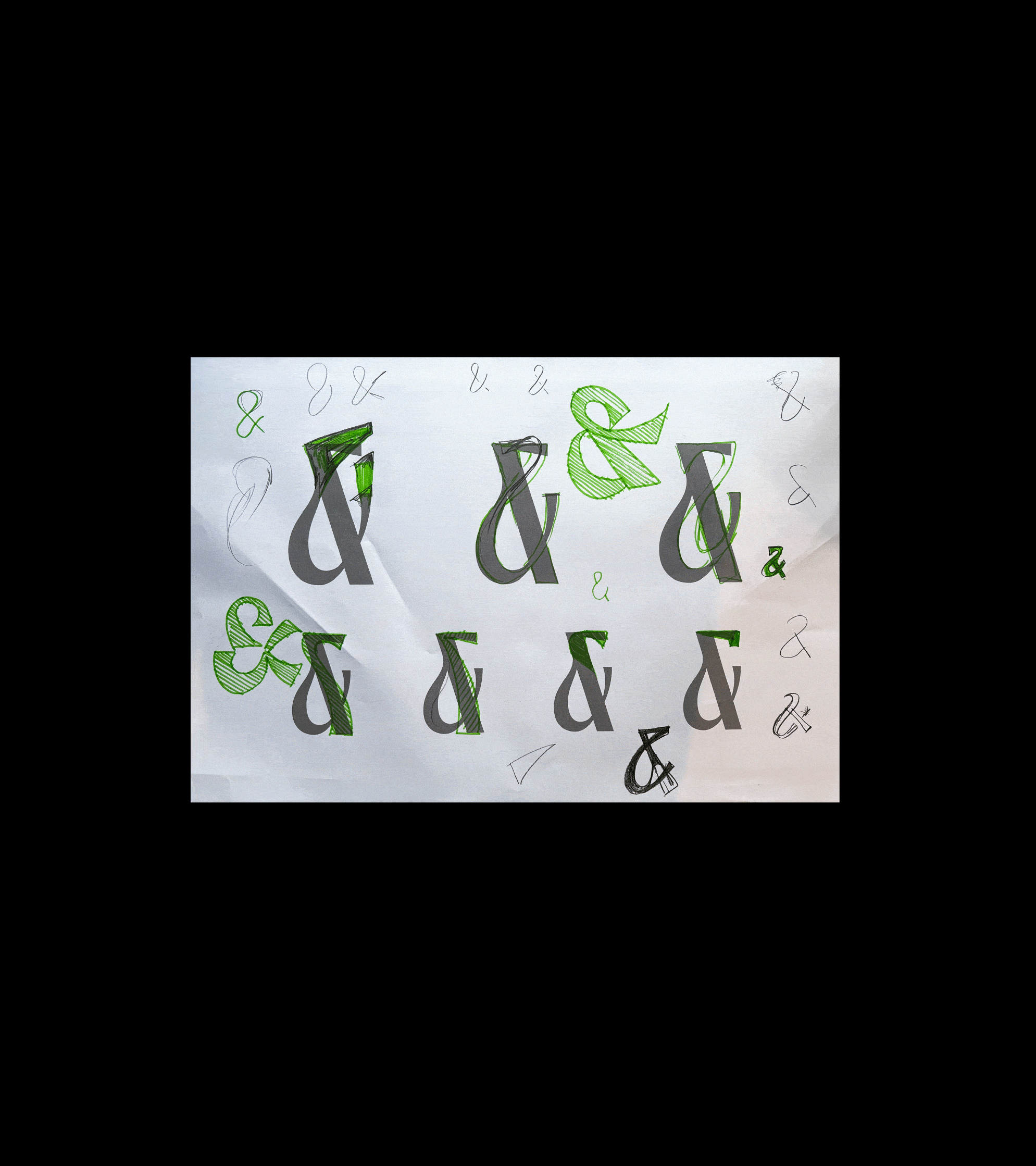
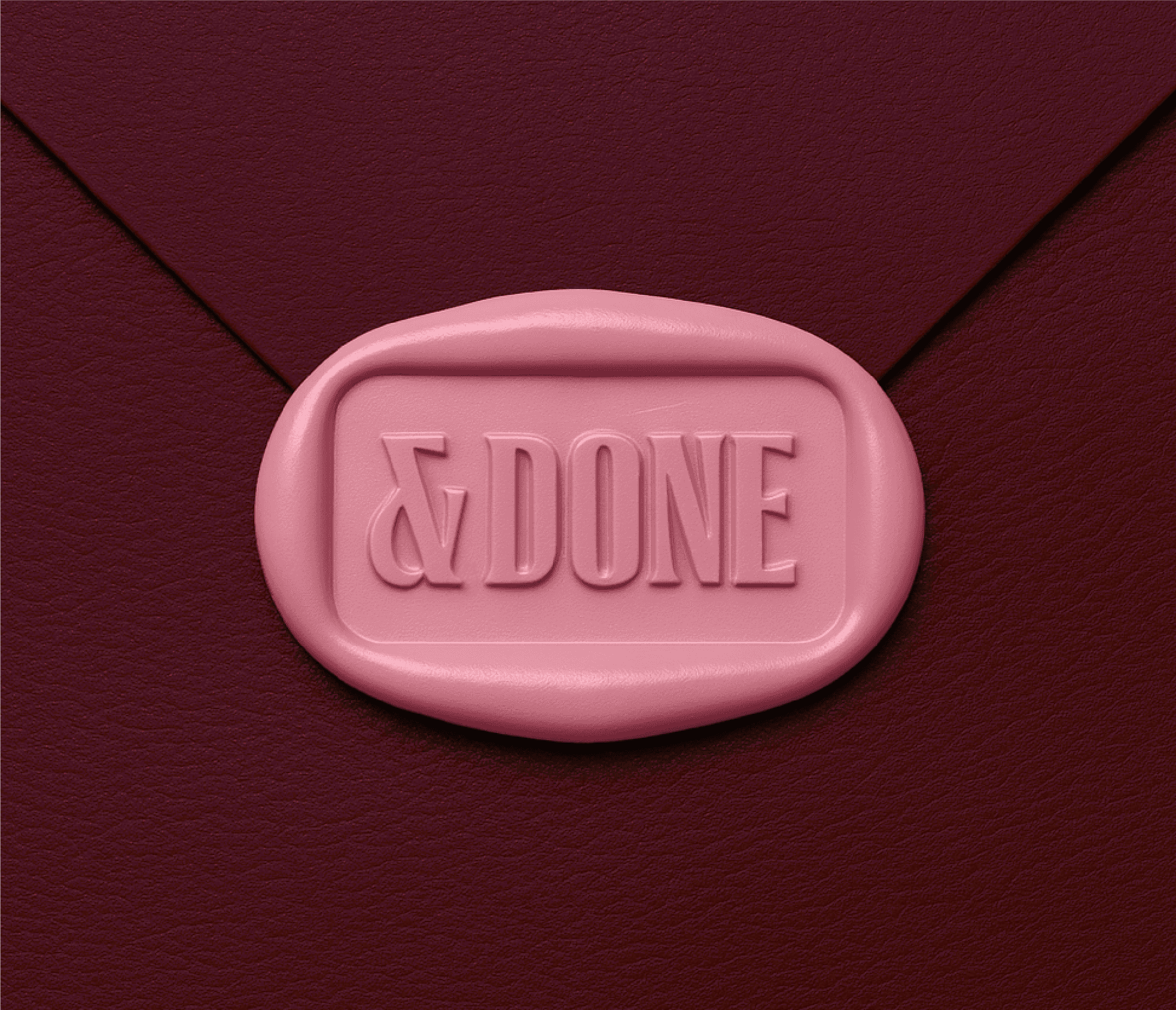
The identity was inspired by The Queen’s Gambit, a story of precision, intellect, and quiet power. The ampersand was crafted to resemble a chess piece — tall, confident, and elegant. It became the brand’s central icon, representing completion and control.
Visual Language
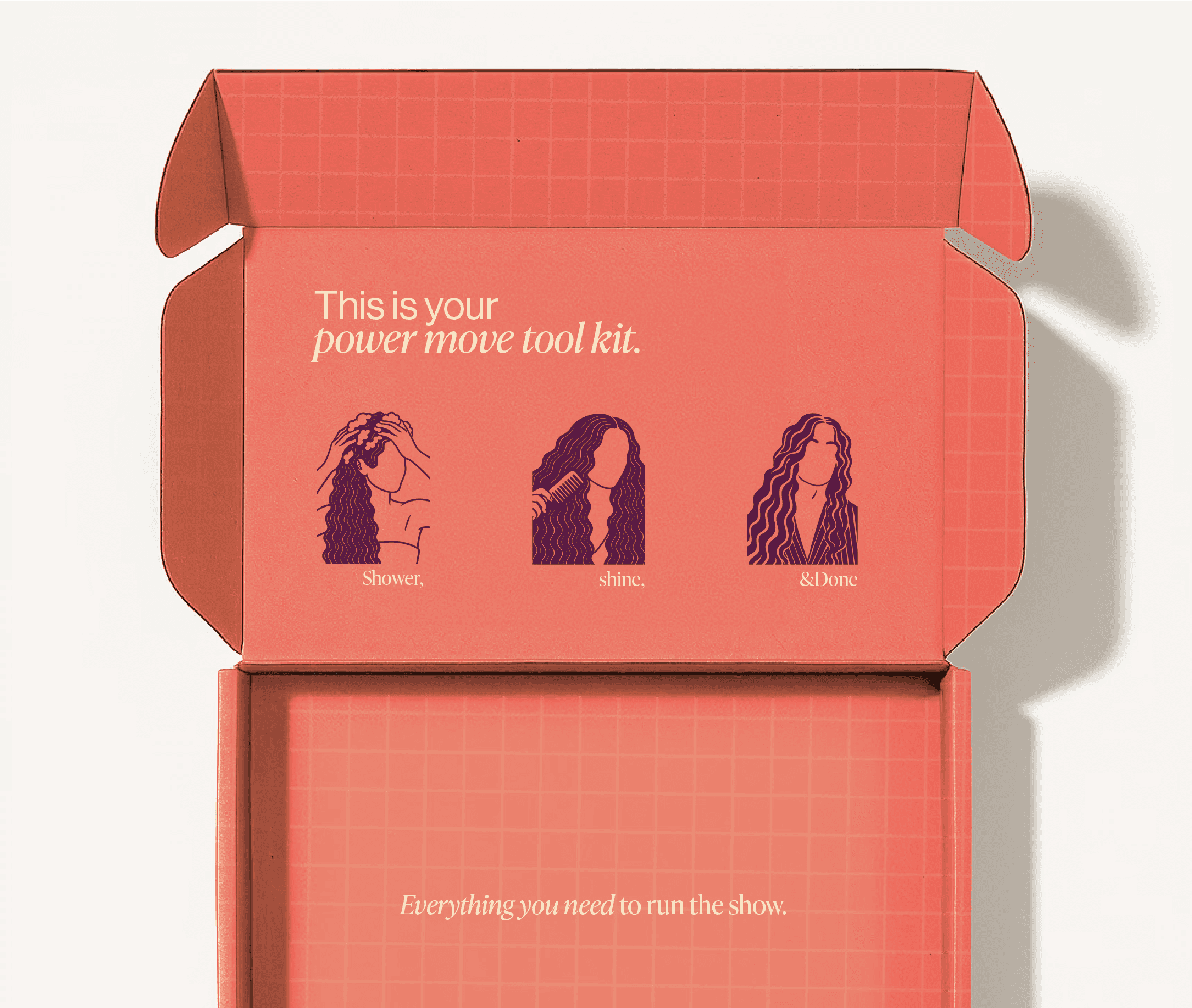
The visual system was built around the idea of affirmation. Short, direct statements replace traditional beauty jargon, creating a tone that’s empowering, relatable, and self-assured. Layouts use stamps, cropped compositions, and confident spacing to convey movement and decisiveness.
Colours
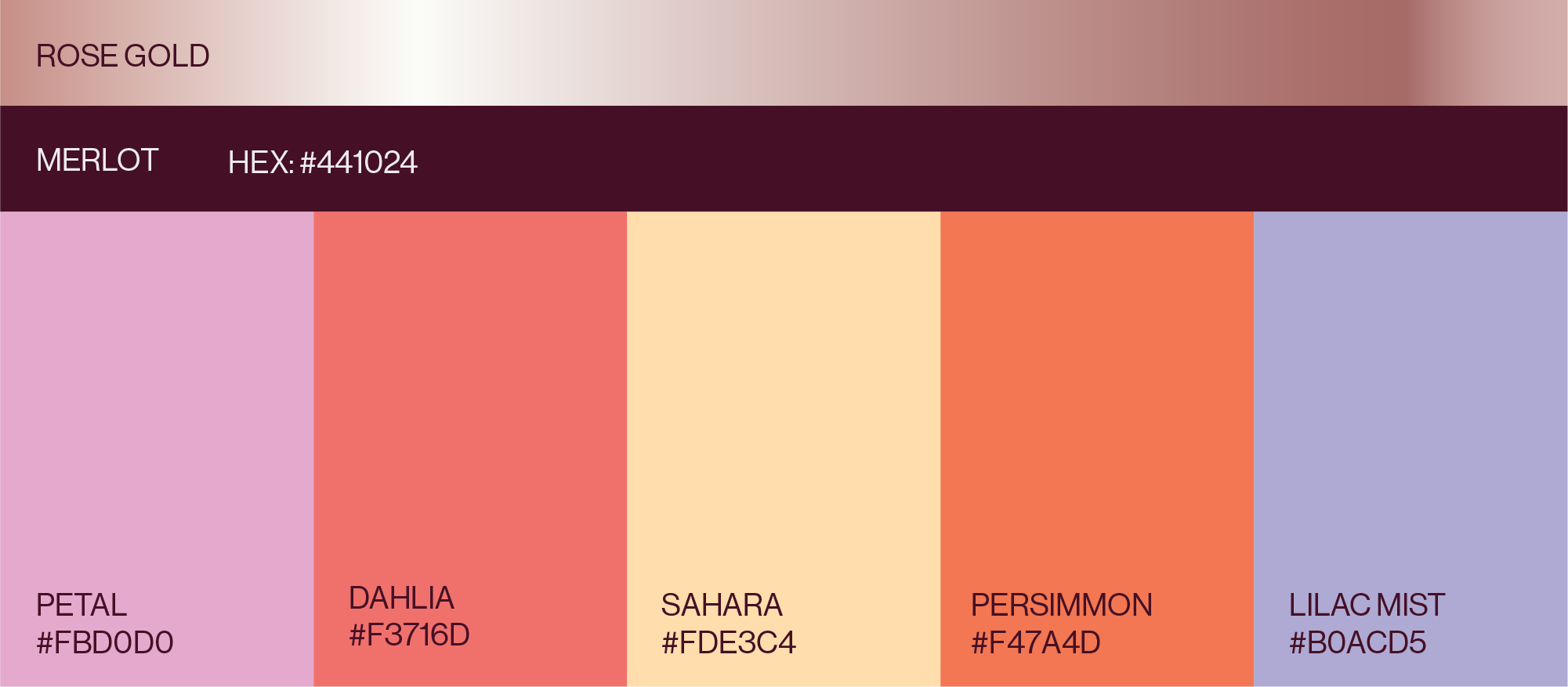
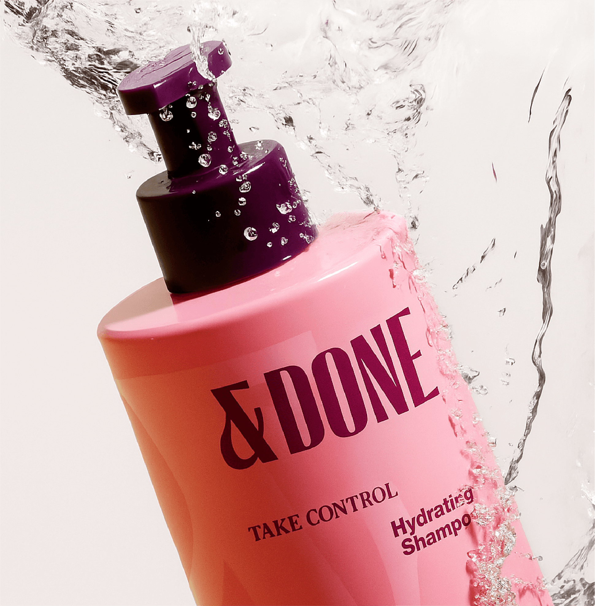
The palette owns a deep merlot — rich, bold, and distinct from the soft pastels seen across the category. It is paired with warm accents of pink, lavender, and yellow to express nourishment, strength, and femininity.
Typography
A modern serif meets a clean sans serif, blending sophistication with clarity. The contrast creates a timeless yet contemporary identity that balances strength with elegance.Photography
The imagery captures women in their element — leading meetings, running errands, getting things done. They are not overstyled; they are real, confident, and composed. Product photography focuses on texture, shine, and detail, reinforcing the sense of quality and efficacy.
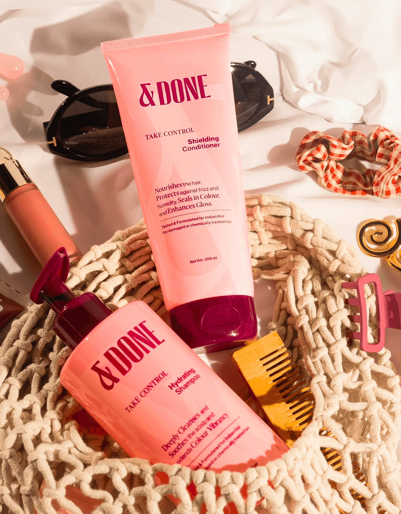
Packaging
Two distinct ranges were designed under one unified system — the Salon Range and the D2C Range.
D2C Range
The D2C line carries the same design DNA but introduces a warmer, more nurturing tone. The packaging uses a solid Indian pink that feels joyful and confident. It celebrates self-care without fuss, giving consumers an approachable sense of everyday luxury.
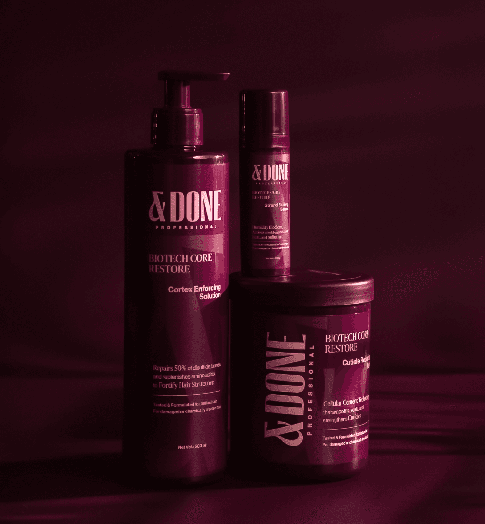
Salon Range
Premium merlot bottles with gold foil details create a sense of luxury and credibility. The labels are clean and purposeful, featuring sharp copy and the ampersand as a subtle brand anchor. The design feels professional yet approachable, bridging the gap between salon-grade and consumer trust.
&done stands for women who lead with confidence and live on their own terms. By pairing cultural insight with bold design, the brand redefines what premium means for Indian hair, keeping it powerful, effortless, and made to keep up.


