Kolkata’s restaurant and bar scene was split down the middle: nostalgia-heavy concepts on one side, loud and pressure-driven party spots on the other. Abhimanyu, founder of Team Zing, is seasoned in the F&B industry. He didn’t want another frilly fine-dining restaurant. He wanted to bring Kolkata a place that felt honest and alive.
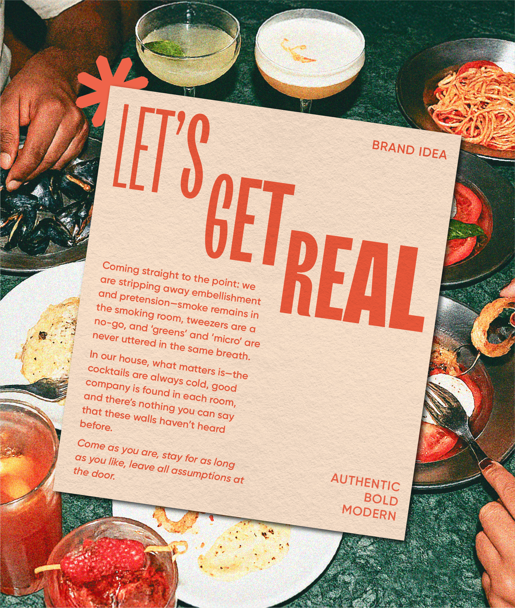
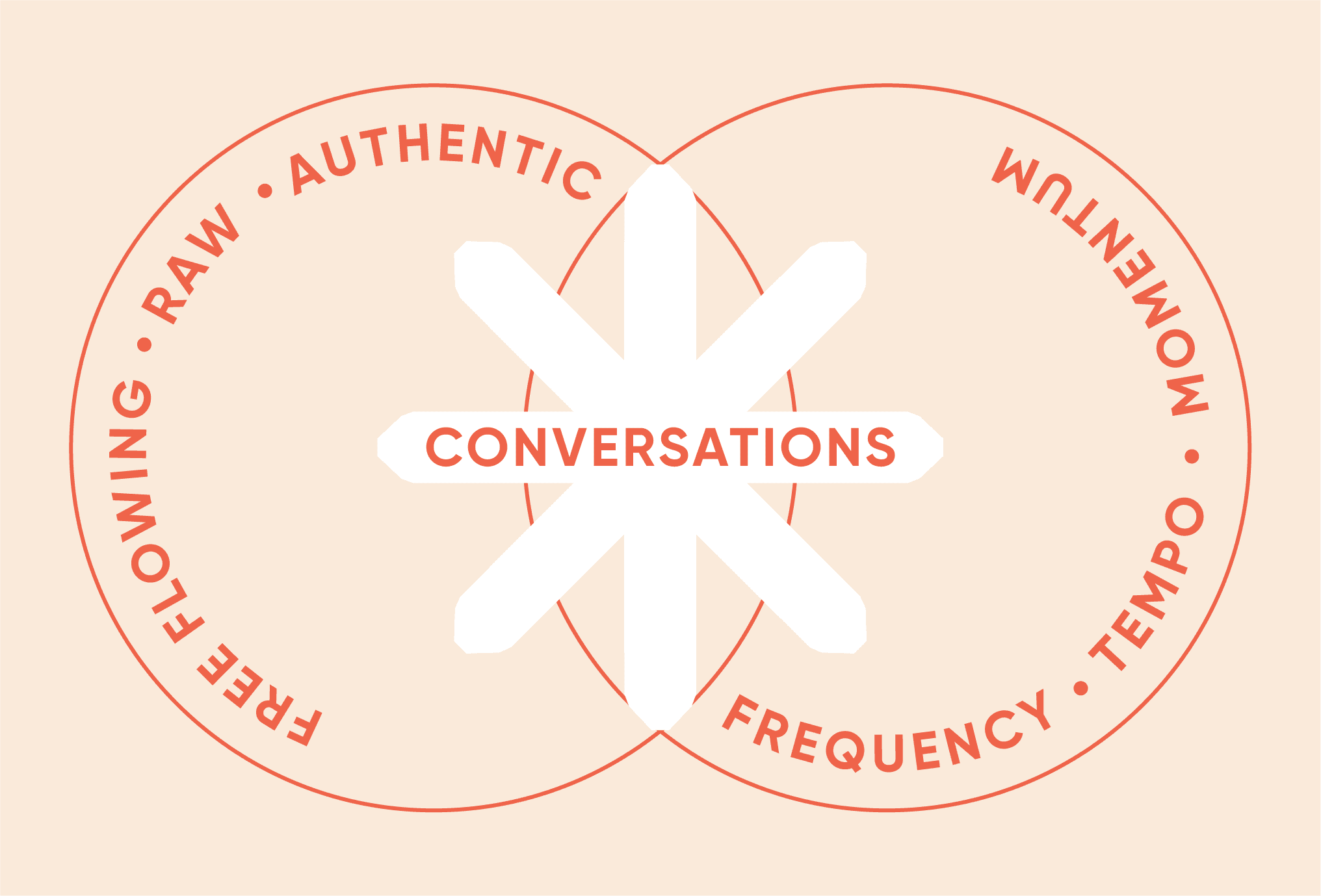
Understated doesn’t have to mean boring. We wanted edge, energy, and movement. The identity grew from the tempo of conversations, fluid and dynamic, shifting between quick exchanges and slow pauses.
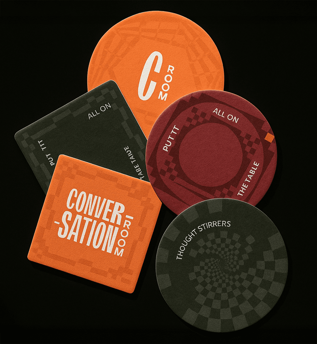
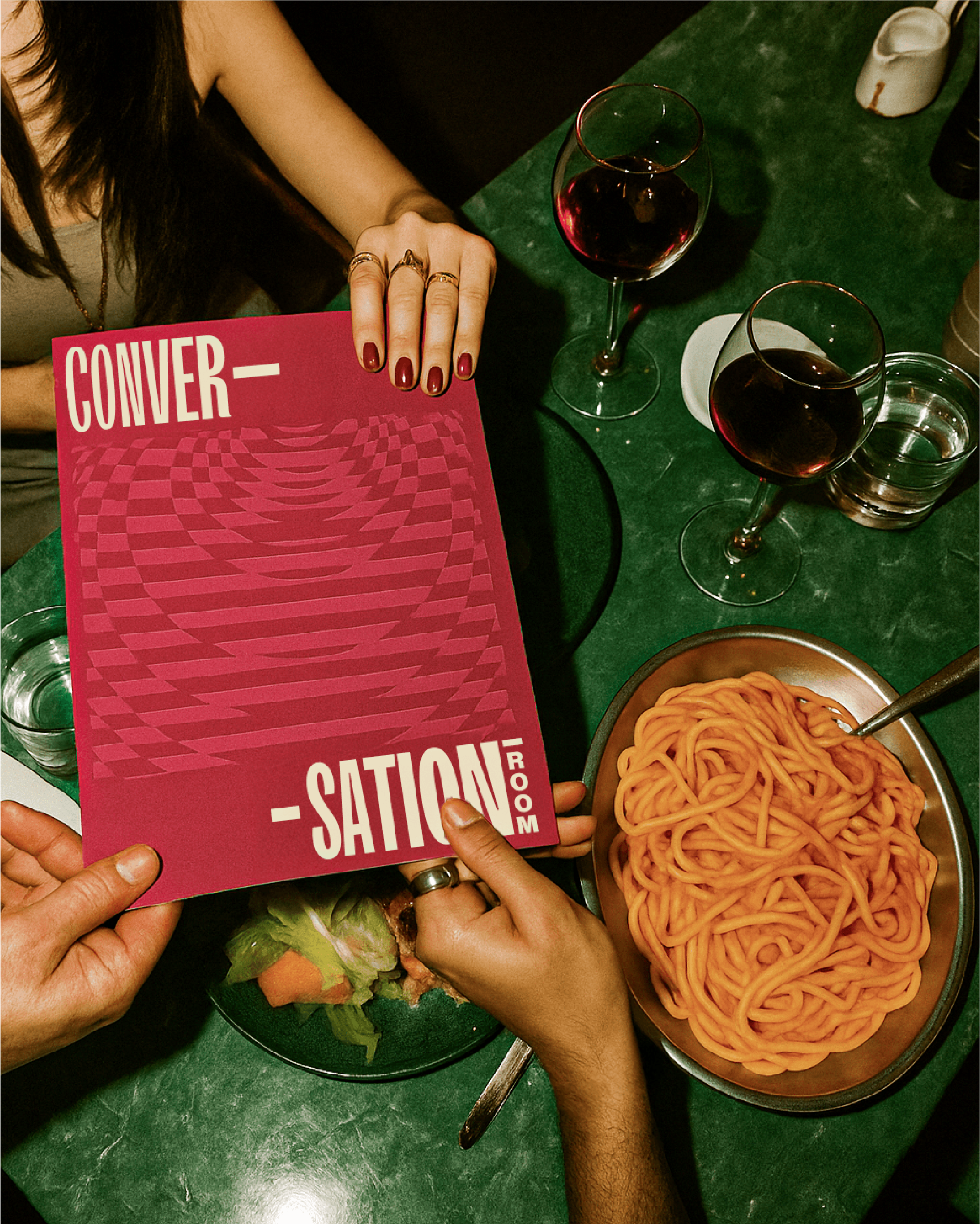
Logo: A sharp, dynamic wordmark with subtle cuts and playful variable typography. The hyphen doubles as a mark of continuity in conversation.
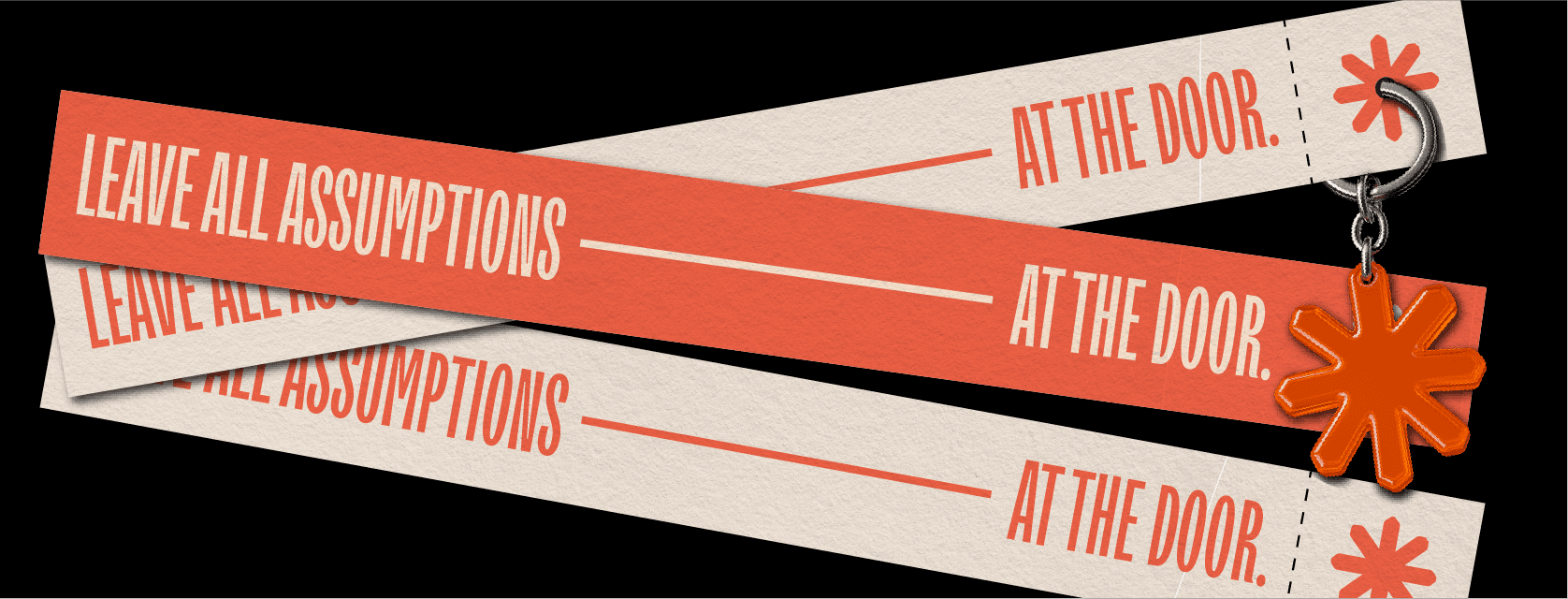
Typography: Type became the hero, bold, flexible, and variable, carrying rhythm without relying solely on copy.
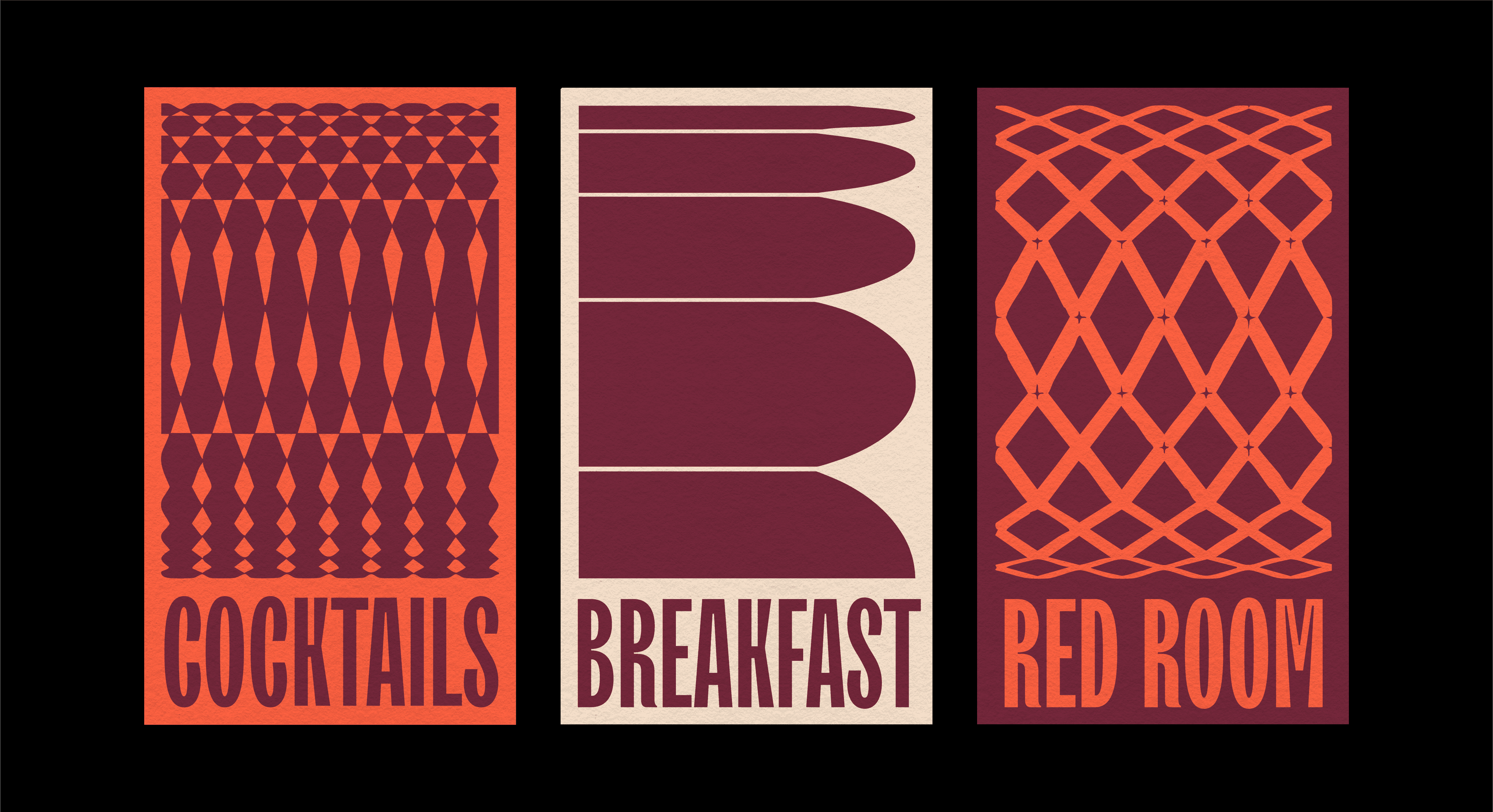
Color Palette: Orange and plum primaries set against eggshell, deep green, and brown.
Patterns: Inspired by architectural details from the space, reimagined as flexible motifs for borders, textures, and backgrounds.
Photography: Raw, candid, and a little messy, capturing the honesty of real nights out.
Modern F&B spaces are rarely designed for depth. They tend to be dim, pressure-driven, and transactional. In the age of instagramification, experiences feel performative, blurring the line between real and superficial connection. The result is emotionally unsatisfying. In Kolkata, a city known for its adda culture of long and unhurried conversations, this absence was felt even more sharply.
How do we design a space where human interaction needs no frills?
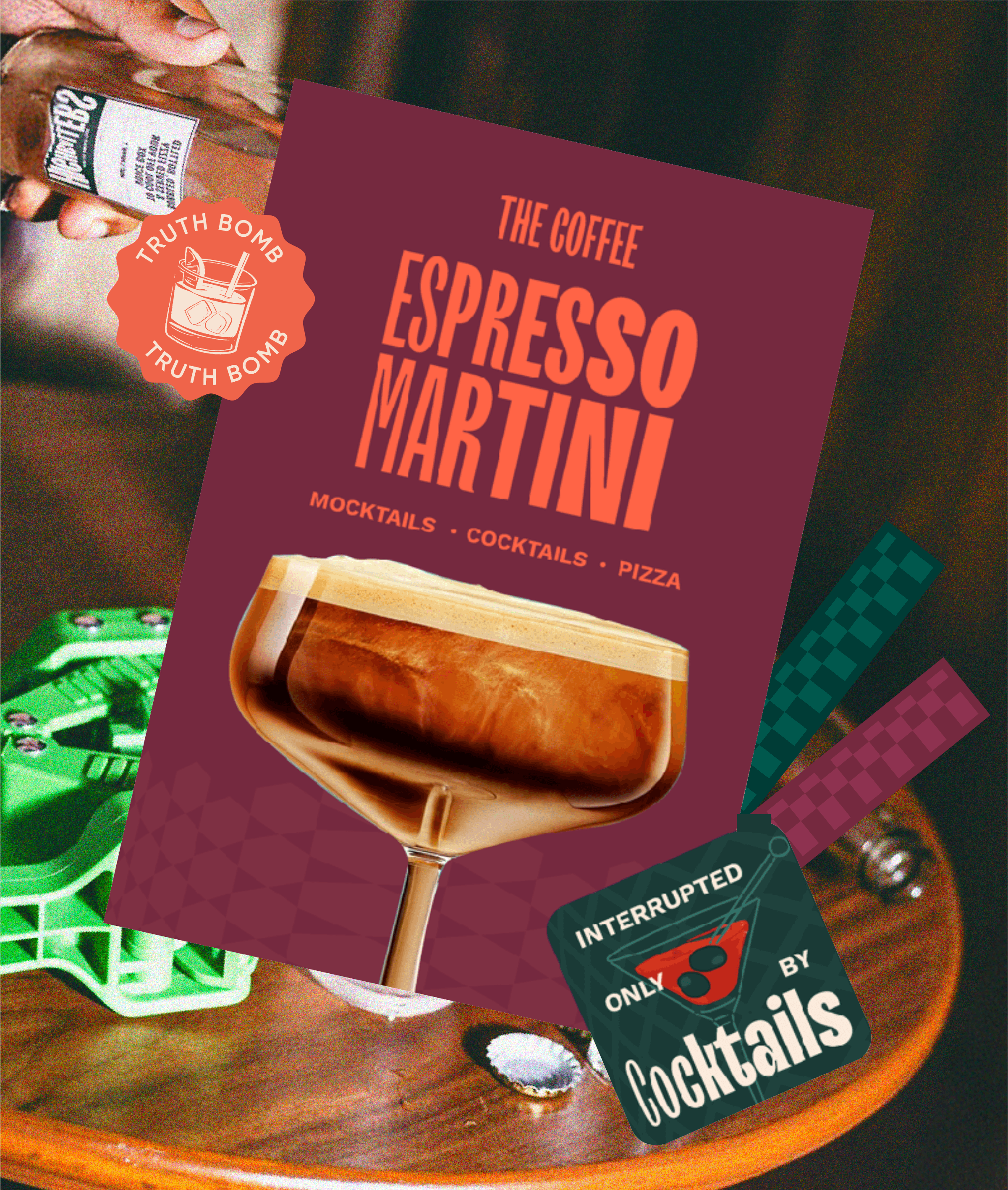
We didn’t see menus as just functional. No interaction is too small, every touchpoint is a chance to connect.
Day Menu: Light and casual for coffee and sandwiches, with playful format, opening, and copy.
Food & Bar Menu: Designed like a photo essay. Black-and-white imagery, interactive layouts, and visual storytelling replaced wordiness. The randomness of images grew from the food section into the drinks section, mirroring the shift in mood.
After-Hours Menu: A bold one-pager in orange with a dynamic pattern.
Merch & Collateral
We created merch and collateral that felt authentic to the community — t-shirts, matchboxes, ashtrays, and coasters designed as keepsakes from a night worth remembering. The signage system and staff uniforms carried the same conversational tone, using simple typography and familiar cues to reflect the brand’s easy, open spirit.